A pie chart in Canva is created by generating your chart in a separate browser-based tool and then inserting the exported PNG into your Canva design as an image, because Canva itself does not ship a native chart element for slices. The fastest working pattern is to type your labels and values into a text box, let a pie chart generator render the slices with a legend, download the result as a PNG, and then drop that PNG into a Canva project the same way you would add any other image. Canva's own design canvas is built around layers, text, and stock media, so even its "Charts" category relies on bar and line visuals rather than interactive pie slices. By separating the chart math from the design polish, you get a sharper image, exact percentages, and full control over the legend typography once the chart sits inside your layout.
Most readers searching for this are trying to put together a quick report slide, a school infographic, a social media carousel, or a marketing one-pager in Canva and want a real pie chart instead of stacking circles or free-handing wedges. The trouble is that Canva's chart block leans heavily toward bar, line, and area visuals, and the few pie presets are limited in how many slices they handle cleanly. That is why a dedicated pie chart tool is the right companion: you keep your numbers in plain text, you can edit them by hand, and you end up with a single image asset that drops into any template.
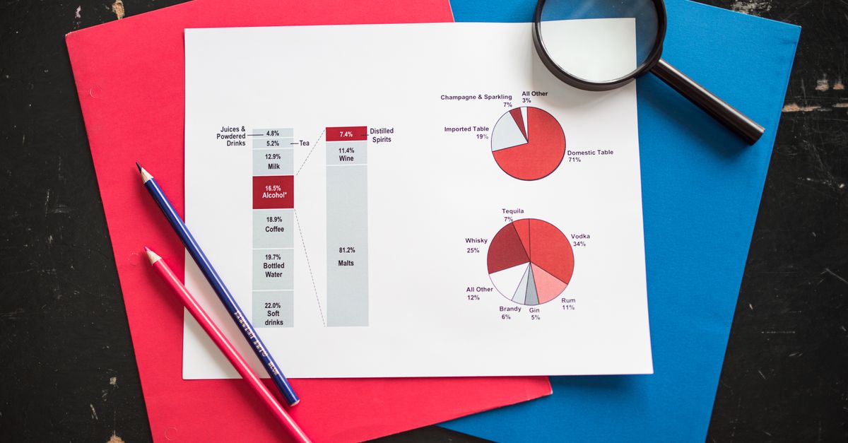
Why Canva Alone Isn't Enough for Pie Charts
Canva is a layered design tool, not a data engine. You can drag circles onto a page, rotate them, and color them by hand, but every wedge angle has to be eyeballed and every percentage has to be calculated by you. For a chart with three slices that is workable. For six or more slices, the math gets fiddly fast, and small errors compound into a chart that visibly does not add up to 100%.
Canva also lacks live data binding for pie charts. If your numbers change, you have to redo the wedges from scratch. By contrast, when you build the chart in a browser tool first and then import the image, your data lives in a plain text list that is easy to edit, paste, or share with a colleague who is not a designer.
What You Need Before You Start
Before opening Canva, gather three things:
- A short list of category labels and the numbers that go with them, written as "Label, Value" on each line.
- A rough idea of the headline or title you want to appear above the chart.
- An open Canva design, or the template you plan to drop the chart into.
You do not need any chart-building skill, any spreadsheet, and any image editor. The chart is generated in your browser and downloaded as a single PNG file.
Build Your Pie Chart in the Pie Chart Maker
The Pie Chart Maker at Lizely is built for exactly this kind of "list to chart" workflow. It runs entirely in the browser, so nothing about your data leaves your device until you choose to download the image. That matters if your numbers come from internal sales data, student scores, or anything else you would not paste into a third-party cloud service.
- Open the Pie Chart Maker page in a new browser tab.
- In the data box, type one slice per line using the format "Label, Value". For example, type Chrome, 63 on the first line, Safari, 19 on the second, and so on.
- Watch the chart redraw on the right side of the page as you type. Each slice gets its own color, and the legend updates with both the raw value and the percentage of the total.
- Optionally add a chart title in the title field. Keep it short so it sits cleanly above the slices.
- Check that every value is positive and that the labels read naturally. Negative values and zero values do not produce meaningful slices, so swap or remove them before downloading.
- Click the Download button to save the chart as a PNG image to your computer.
The whole sequence is short on purpose. The tool handles the angle math, the legend layout, and the color choices so you can stay focused on the numbers and the message.
Drop the Chart Into Canva
Now switch back to your Canva project. Treat the downloaded PNG like any other image upload.
- In the left sidebar of Canva, click Uploads.
- Click Upload files and pick the pie chart PNG you just saved.
- Drag the uploaded chart from the media panel onto your canvas.
- Resize and reposition the chart inside your layout. Canva's corner handles keep the aspect ratio locked, so the circle stays a circle.
- If you want a transparent background, re-export the chart from the Pie Chart Maker with a transparent backdrop, then re-upload it to Canva.
Once the chart is on the canvas, you can layer text, icons, or background shapes on top of it. Canva treats the PNG as a flat image, so the chart will not become pixelated as long as you do not stretch it past its native resolution. If you need a bigger chart, generate it at a larger size in the chart tool rather than scaling it up aggressively inside Canva.
Edit the Numbers Later Without Redrawing
The real benefit of generating the chart outside Canva is what happens when the numbers change. Say the marketing team sends updated traffic figures after you have already placed the chart in a presentation. You do not have to rebuild anything inside Canva.
Open the Pie Chart Maker again, paste the updated list in the same "Label, Value" format, and redownload. Then in Canva, drag the new PNG over the old one on the canvas, align it to the same bounding box, and delete the old chart. Because the new file is generated from the same layout, alignment tends to be a one-step job. For broader help with turning any list of numbers into slices, the guide on making a pie chart from any list of numbers walks through the data side of things in more detail.
Design Tips So the Chart Looks Right in Canva
A clean chart on its own does not guarantee a clean Canva layout. A few small choices make a big difference once the chart is sitting inside a slide or social post.
- Limit slices to five or six whenever possible. More than that and the legend starts to crowd the slices.
- Pick a chart title that states the takeaway, not just the topic. "Mobile now drives 71% of traffic" beats "Traffic by device".
- Match the chart's slice colors to your Canva palette. You can sample colors from the PNG using Canva's built-in color picker and reuse them elsewhere on the slide.
- Leave breathing room around the chart. A pie chart pushed against the edge of a slide feels cramped and is harder to read on mobile.
Canva also makes it easy to add a subtle drop shadow or a colored ring behind the chart to help it sit on top of busy backgrounds. Just remember that any visual effects apply to the image as a whole, not to individual slices.
Common Mistakes When Making Pie Charts in Canva
Three pitfalls come up over and over. First, people try to build wedges manually with rotated ovals and waste an afternoon on angles that are slightly off. Second, they paste a screenshot of a chart from another site, which is fine for one-off use but produces blurry results when scaled. Third, they try to force a Canva "Chart" block to look like a pie and end up with something that resembles a donut graph instead.
Using a dedicated chart tool avoids all three problems. Your angles are mathematically correct, the source is a sharp PNG rather than a screenshot, and the result is unmistakably a pie rather than a fudged bar variant. The same approach is useful for anyone who also works with chart-heavy slides in PowerPoint or Google Slides, since the PNG exports cleanly into both.
Quick Recap
| Step | Where it happens | What you get |
|---|---|---|
| Type labels and values | Pie Chart Maker data box | Live preview of slices and legend |
| Add a title (optional) | Pie Chart Maker title field | Headline rendered above the chart |
| Download the PNG | Pie Chart Maker download button | A flat image file on your computer |
| Upload and place in Canva | Canva Uploads panel and canvas | The chart embedded in your design |
That is the entire pipeline. There is no native pie chart element in Canva to learn, no spreadsheet import to wrestle with, and no design skill required beyond placing and resizing an image. For readers who also want to size a pie chart more aggressively inside a different tool, the Tableau pie chart sizing guide covers the same idea in a Tableau context.
If you build slides, social graphics, or report covers in Canva often, keep the Pie Chart Maker bookmarked. Every chart you generate becomes a reusable image asset, and the data behind it stays in a plain text list you can edit in seconds.
Related reading: How to Create a Bar Chart With Multiple Bars in SVG.
Related reading: How to Make a Good Mind Map in Minutes Without Design Skills.