A pie chart is the fastest way to show how a whole breaks into parts, and the Pie Chart Maker at /generators/pie-chart-maker/ lets you build one straight from a plain list of labels and numbers. You type your data in the format Label, Value, one item per line, and the chart redraws immediately with colored slices, a built-in legend that shows both the raw values and the percentage each slice represents, and a clean layout that is ready to drop into a slide, a document, or a post. When you are happy with the result, you click Download and save the chart as a PNG image. There is nothing to install, no account to create, and no data leaves your browser.
Many readers land on this page after searching for help with the Minecraft debug pie chart, which is the small overlay that appears when you press F3 + G in the game. That in-game chart is controlled by Minecraft's settings, not by an external tool, so this guide focuses on the situation players often face next: they want a real, full-size pie chart they can share, print, or embed. The same approach also helps teachers, students, and anyone preparing a quick visual who needs a clean chart without opening a spreadsheet. If you are still trying to enlarge the in-game overlay, the dedicated walkthrough on how to make the pie chart bigger in Minecraft covers the GUI scale, resolution, and mod options that actually change its size.
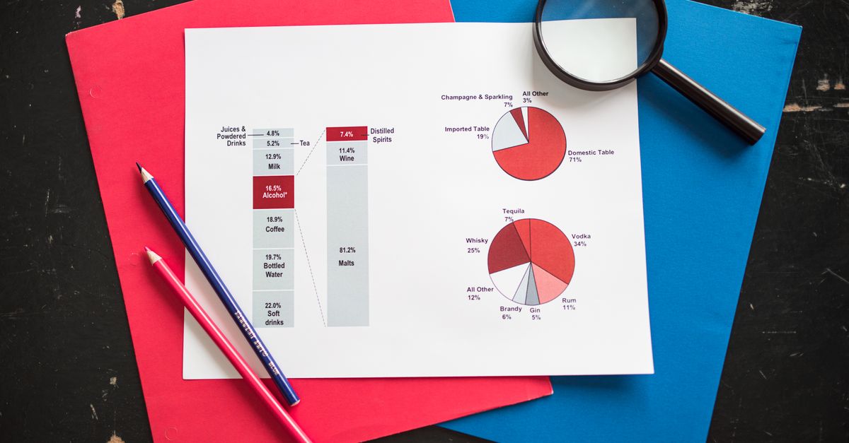
What the Pie Chart Maker Does
The tool takes a list of categories and their counts, percentages, or any numeric values, and turns them into a circular chart where each slice is sized in proportion to its share of the total. As you type, the chart updates in real time, so you can add, remove, or edit rows and see the new picture immediately. The legend on the side or below the chart shows the label, the original value, and the percentage of the whole, which removes the need to do the math by hand.
Because the chart is rendered from a simple two-column input, the tool works just as well for browser usage data as it does for inventory tallies, classroom poll results, or a quick breakdown of a budget. If you need a random starting dataset for testing the tool, the Random Number Generator can produce a quick set of values to paste in. For larger team or classroom splits, the guide on creating random teams from a roster shows a related workflow for grouping people.
Prepare Your Data Before You Start
Good charts begin with tidy data. Before you open the tool, gather your categories and decide what number represents each one. The label is the text that appears in the legend and as a tooltip on the slice, and the value is the number that controls the slice size. Values can be raw counts, percentages, dollar amounts, or any other positive number; they do not need to add up to 100, because the tool converts them to percentages automatically.
| Column | Format | Example |
|---|---|---|
| Label | Short text, no commas in the name | Chrome |
| Value | Positive number, decimals allowed | 63 |
| Full row | Label, comma, space, value | Chrome, 63 |
Aim for between two and seven slices for the clearest result. Pie charts get crowded quickly, so if your list is longer, consider grouping small categories into an "Other" bucket or switching to a bar chart for very granular comparisons.
Build a Pie Chart Step by Step
- Open the Pie Chart Maker in your browser.
- Click into the data box and type your first row in the format Label, Value, for example Chrome, 63. Press Enter to move to the next line.
- Add one row per category. Keep each label on a single line, place a comma between the label and the number, and use positive numbers only. For instance: Firefox, 17 on the next line, then Safari, 9, and so on.
- Watch the chart on the right redraw as you type. Each slice gets its own color, and the legend lists every label along with its value and percentage of the total.
- Optionally add a chart title in the title field to give readers context, such as "Browser Market Share" or "May Survey Results."
- If a slice looks too small to read or two slices are nearly the same size, return to the data box and adjust the values, or merge the smallest categories into an "Other" row.
- Click the Download button to save the finished chart as a PNG image to your computer.
- Open the PNG in your presentation, document, or chat of choice. Because the image is a PNG, it scales cleanly when inserted into slides or shared in a message.
Read the Legend and Percentages Correctly
The legend is where most of the useful information lives. Each entry shows the label you typed, the original value you entered, and the percentage that slice represents out of the total of all values. If your raw values are percentages, the chart will display those values as a share of 100, so the slice sizes and the legend numbers will line up directly. If your raw values are counts, the percentage shows that count's share of the total, which is usually what readers want to see.
To estimate any percentage by hand, divide a single value by the sum of all values and multiply by 100. For the example above, 63 out of 63 + 17 + 9 + 5 + 3 + 3 = 100 gives 63%, which matches the legend. Doing the check for one or two slices is a good way to confirm your data was entered correctly.
Common Formatting Tips for Cleaner Charts
- Keep labels short. A label like "Q1 Sales" is clearer than "First quarter sales for the northern region."
- Use consistent units. Mix dollars with dollars, counts with counts, and percentages with percentages so the comparison is fair.
- Order rows by size, largest first, to make the chart easier to scan.
- Round noisy decimals. Values like 12.7384 can be entered as 12.74 for a tidier legend.
- Limit the number of slices. Anything beyond seven categories is usually better shown as a bar chart or grouped into an "Other" row.
When a Pie Chart Is the Wrong Choice
Pie charts are best for showing parts of a whole when there are only a few categories and the differences between them are large enough to see. They are not great for comparing many similar values, for tracking changes over time, or for showing negative numbers. If your data has more than seven categories, very close values, or you need to compare groups side by side, a bar chart, a stacked bar, or a line chart will communicate the same information more clearly. The same browser-based approach that powers the Pie Chart Maker also covers simple visual choices like a quick dice roll for picking a category at random, or a coin flip for binary yes or no questions.
Troubleshooting Common Issues
If a slice is missing, check the data row for a missing comma, a stray letter in the value, or a negative number, all of which the tool will skip. If two slices look the same color, that usually means two rows share a label, so rename one to make the categories distinct. If the legend is cut off, the chart is simply tall enough to display every entry, and you can either reduce the number of rows or scroll the page. If the downloaded PNG looks blurry, try viewing it at its native size rather than stretching it inside a slide deck, since the file is exported at the same resolution shown on screen.
Putting It All Together
For a quick classroom poll, type each option and the number of students who picked it, add a title like "Favorite Fruit," and download the PNG to drop into a slide. For a personal budget breakdown, list each category and the dollar amount, then group small line items into "Other" to keep the chart readable. For a gaming stats summary, paste in your counts of kills, deaths, assists, and any other categories you want to compare, and the tool will produce a clean chart that fits a forum post. In every case, the workflow is the same: type your rows in the Label, Value format, watch the chart build itself, and download the PNG when you are happy with the result.
If you're weighing options, Generate a List of Random Things to Do in Minutes covers this in detail.
If you're weighing options, How to Make a Pie Chart Bigger in Tableau covers this in detail.