A pie chart is a circular graphic that divides data into slices to show relative proportions of a whole. Each slice’s angle corresponds to its percentage of the total, making it ideal for comparing categories like market share, survey responses, or budget allocations. While Microsoft Excel offers built-in pie chart tools, they often require multiple steps—selecting data, navigating menus, and adjusting formatting—to achieve a clean result. For users who need a quick, hassle-free solution, the Pie Chart Maker provides an alternative: enter your data as simple "Label, Value" pairs, preview the chart instantly, and download it as a PNG without leaving your browser.
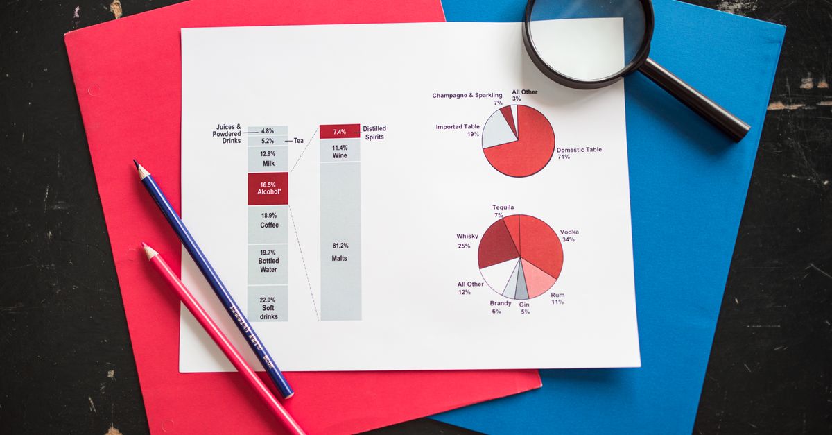
When to Use a Pie Chart
Pie charts work best when you need to emphasize the relationship between parts and a whole. They’re most effective when:
- Your data sums to 100% (e.g., survey responses, expense categories, or demographic breakdowns).
- You have 2 to 6 categories—too many slices make the chart hard to read.
- The differences between categories are significant enough to be visually distinct.
- You’re presenting to an audience that benefits from a simple, intuitive visualization.
For example, a pie chart can quickly show that 63% of web traffic comes from Chrome, 21% from Safari, and 16% from other browsers. However, if your data includes negative values, overlapping categories, or requires precise comparisons (e.g., "Is Category A larger than Category B by 5%?"), a bar chart or line graph may be more appropriate. Tools like the Bar Chart Maker or Line Graph Maker can handle these scenarios with ease.
How to Make a Pie Chart in Excel
Excel’s built-in pie chart feature is powerful but involves several steps. Here’s how to create one manually:
- Prepare your data: Organize your labels in one column and values in the adjacent column. Ensure the values sum to 100% (or close to it) for clarity.
- Select your data: Highlight both columns, including headers if applicable.
- Insert the chart: Go to the Insert tab, click the Pie Chart icon, and choose a style (e.g., 2-D Pie, Doughnut, or 3-D Pie).
- Customize the chart:
- Add data labels: Right-click a slice and select Add Data Labels, then Add Data Callouts to show percentages.
- Adjust colors: Click the Chart Design tab and use the Change Colors dropdown.
- Add a title: Click the chart title placeholder and type your text.
- Explode a slice: Click a slice to select it, then drag it outward to emphasize it.
- Format the chart: Use the Format tab to adjust fonts, borders, and legend placement.
- Save or export: Right-click the chart and select Save as Picture to download it as a PNG or JPEG.
While Excel’s tools are robust, they can be time-consuming for simple tasks. For users who need a faster solution, the Pie Chart Maker eliminates these steps entirely.
Why the Pie Chart Maker Is Faster and Simpler
The Pie Chart Maker is designed for speed and ease of use. Unlike Excel, which requires navigating menus and formatting options, this tool streamlines the process into three simple steps:
- Enter your data: Type or paste your labels and values into the input box, one per line, in the format "Label, Value" (e.g., "Chrome, 63"). The tool automatically recalculates the total and adjusts the chart.
- Preview the chart: Watch the pie chart update instantly as you type. Each slice is colored distinctly, and a legend displays the label, value, and percentage for clarity.
- Download the chart: Optionally add a title, then click Download to save the chart as a high-resolution PNG. No formatting, no fuss—just a clean, ready-to-use image.
The tool also handles edge cases gracefully. For example, if your values don’t sum to 100%, the chart still renders correctly, showing each slice’s proportion of the total. This flexibility is ideal for quick presentations, reports, or social media posts where precision is less critical than speed.
How to Use the Pie Chart Maker: Step-by-Step
Here’s how to create a pie chart in minutes using the Pie Chart Maker:
- Open the tool: Visit Pie Chart Maker in your browser. No installation or sign-up is required.
- Enter your data: In the input box, type each label and value on a new line, separated by a comma. For example:
Chrome, 63
Safari, 21
Firefox, 10
Edge, 6
- Preview the chart: The pie chart updates automatically as you type. Each slice is colored, and the legend shows the label, value, and percentage (e.g., "Chrome: 63 (63%)").
- Add a title (optional): Click the Title field and enter a name for your chart, such as "Browser Market Share 2026."
- Download the chart: Click the Download button to save the chart as a PNG file. The image is high-resolution and ready to use in presentations, documents, or online.
The entire process takes less than a minute, making it ideal for users who need a quick, professional-looking chart without the overhead of Excel or other desktop software.
Comparing Pie Chart Tools
Not all pie chart tools are created equal. The table below compares the Pie Chart Maker to Excel and other common alternatives:
| Feature | Pie Chart Maker | Microsoft Excel | Canva |
|---|---|---|---|
| Data input method | Simple "Label, Value" text | Spreadsheet cells | Manual entry or CSV upload |
| Instant preview | Yes | No (requires manual updates) | Yes |
| Download format | PNG | PNG, JPEG, SVG, PDF | PNG, JPEG, PDF |
| Customization options | Title, colors, legend | Extensive (colors, labels, 3-D effects) | Templates, fonts, graphics |
| Privacy | No data leaves your browser | Data stored locally or in OneDrive | Data uploaded to Canva’s servers |
| Best for | Quick, private charts | Detailed, formatted reports | Social media or branded graphics |
For users who prioritize speed and privacy, the Pie Chart Maker is the clear winner. It’s also a great option for those who don’t have access to Excel or prefer not to use it. For more complex visualizations, tools like the Bar Chart Maker or Line Graph Maker offer additional flexibility.
Tips for Effective Pie Charts
Even with a simple tool, following best practices ensures your pie chart is clear and impactful:
- Limit slices to 6 or fewer: Too many slices make the chart cluttered and hard to read. If you have more categories, consider grouping smaller ones into an "Other" slice.
- Order slices logically: Arrange slices from largest to smallest in a clockwise direction, starting at the 12 o’clock position. This makes it easier for viewers to compare proportions.
- Use contrasting colors: Ensure each slice is distinct from its neighbors. The Pie Chart Maker automatically assigns contrasting colors, but you can adjust them if needed.
- Label clearly: Include both the label and percentage for each slice. The tool’s legend handles this automatically, but double-check for accuracy.
- Avoid 3-D effects: While Excel offers 3-D pie charts, they distort the proportions and make it harder to compare slices. Stick to 2-D for clarity.
- Highlight key slices: If one slice is particularly important, "explode" it slightly by dragging it outward in Excel or using a tool that supports this feature. The Pie Chart Maker doesn’t include this option, but the distinct colors ensure visibility.
For more advanced charting needs, such as creating a bar chart with multiple bars, explore additional tools and guides on this site.
Pitfalls to Watch For
Even simple charts can go wrong. Here are pitfalls to watch for when creating pie charts:
- Using pie charts for non-proportional data: Pie charts only work when the data represents parts of a whole. Avoid using them for data that doesn’t sum to 100%, such as time-series data or comparisons across unrelated categories.
- Overloading with slices: More than 6 slices make the chart hard to read. If you have many categories, consider a bar chart or grouping smaller values into an "Other" slice.
- Ignoring accessibility: Ensure your chart is readable for color-blind users by using distinct colors and including a legend. Tools like the Pie Chart Maker handle this automatically, but it’s worth verifying.
- Misleading proportions: Avoid manipulating the chart to exaggerate differences. For example, starting the first slice at an angle other than 12 o’clock can distort the viewer’s perception of the data.
- Skipping the legend: Always include a legend or data labels to clarify what each slice represents. The Pie Chart Maker includes this by default, but it’s easy to overlook in other tools.
By avoiding these mistakes, you’ll create pie charts that are both accurate and easy to understand.
Related reading: Generate a Random Date in Excel Within a Range | Lizely.