A bar chart with multiple bars is a single chart that contains two or more bars, each one drawn from its own label and numeric value in a list of 2 to 30 rows. The fastest way to make one without installing software is to paste your label,value pairs into the Bar Chart Maker, check the live preview, and download the result as a standalone SVG that mirrors the preview pixel for pixel.
When you have more than one category to compare, a multi-bar layout is usually the clearest way to show the differences at a glance. A single row of values can be summarized in a sentence, but as soon as you cross three or four categories — top-selling products, monthly signups, survey ratings across several questions — readers start scanning for visual patterns. Tallest bar, shortest bar, gaps in the middle: those patterns are exactly what a bar chart is designed to expose.
The challenge with most charting tools is that "multiple bars" quickly turns into "multiple settings." You find yourself choosing colors, fonts, gridline counts, axis orientations, and dozens of other knobs before a single bar appears. For a quick comparison chart — the kind you need for a slide, a report, or a blog post — that overhead is rarely worth it. A tool that takes plain text and returns a clean SVG removes the friction without giving up control over the data.
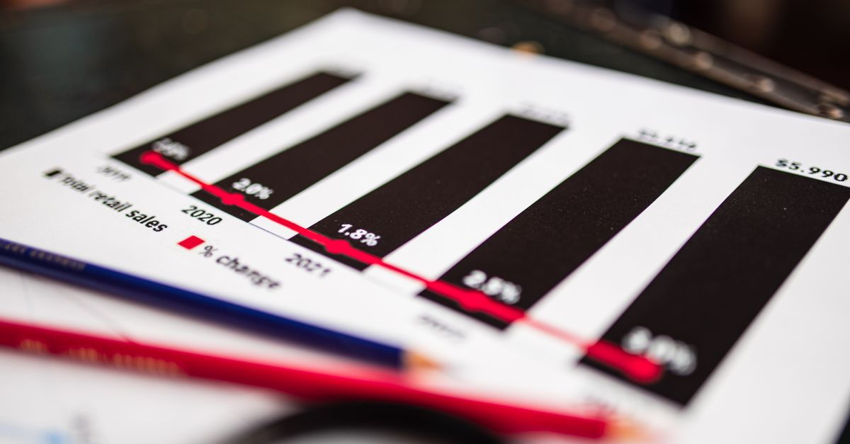
What a multi-bar chart actually contains
Before you start typing rows, it helps to know what the Bar Chart Maker draws so you can shape your input around it. Every chart has the same six ingredients regardless of how many bars you include:
- An optional title sitting above the chart for context.
- Category labels, one per row, printed along the horizontal axis.
- Five numeric tick values along the vertical axis to give the bars a scale.
- A baseline at the bottom that every bar rests on.
- A zero reference so readers know where the count begins.
- The bars themselves, each sized proportionally to its value.
When your data covers a wide range, the tool also shows visible cut-off markers if any bars are too tall or too short to fit the chosen scale cleanly, which is useful when one outlier dominates the rest of the data.
Writing your label,value rows
The data format is deliberately strict so the parser never has to guess what you mean. Each row holds exactly one label and one numeric value, separated by a single comma. No commas inside the label, no commas inside the number, no extra punctuation. A row can be empty to mark a gap, but every non-empty row needs that single comma.
Here is a small example of what a clean input list looks like:
| Row | Example input | Meaning |
|---|---|---|
| 1 | Q1 Signups, 412 | 412 signups in Q1 |
| 2 | Q2 Signups, 587 | 587 signups in Q2 |
| 3 | Q3 Signups, 503 | 503 signups in Q3 |
| 4 | Q4 Signups, 691 | 691 signups in Q4 |
Keep labels short enough to fit under their bar without overlapping. If you have long category names such as "Customer satisfaction, post-redesign," consider trimming to a short form like "CSAT post" and adding the full phrase in surrounding text or a footnote.
Build the chart in the Bar Chart Maker
Once your rows are ready, the actual production step is short. The Bar Chart Maker is designed so that the preview you see is the SVG you will download, so there is no second stage where the file is redrawn with different settings.
- Open the Bar Chart Maker in your browser.
- Type an optional title in the title field if you want one above the chart.
- Paste or type your label,value rows into the input box, one per line, with a single comma between the label and the value.
- Click the Generate button and watch the preview draw on the right.
- Read the category labels under the bars and the five tick values on the vertical axis to confirm the scale.
- Check the baseline and the zero line so you can see where every bar starts.
- If any bars hit the top or bottom of the visible area, look for the extreme-range indicators and decide whether to drop those rows or keep them as visible cut-offs.
- Click the download button to save the SVG file to your computer.
- Open the SVG locally to confirm the saved file looks identical to the preview.
Reading the preview before you download
The preview is the part most people skim past, and that is where small mistakes get locked into the final file. Take a moment to check five things in order.
First, the category labels should sit under the correct bars and be fully visible. If a label is clipped, the row is too long for the chart width, so shorten the label.
Second, the five tick values should span the range of your data without leaving a giant gap. If your tallest value is 691 and the top tick is 1000, the bars will all look small and similar. The tool picks a sensible range automatically, so a huge gap usually means one or two outlier rows are dragging the scale upward.
Third, the baseline should be clearly drawn and sit at the bottom of the plotting area. Every bar should start at that baseline so comparisons stay honest.
Fourth, the zero line should be visible. When your values include both positive and negative numbers, the zero line will float above the baseline, and you will see bars pointing both up and down. That is the correct behavior for a chart containing negative values.
Fifth, watch for any extreme-range indicators. These appear when a single bar is so much larger or smaller than the rest that it cannot be drawn to scale alongside the others. The indicator is a signal that the relative heights you see in the preview are not literally proportional — they are clamped to keep the chart readable.
Why a downloaded SVG is useful
The Bar Chart Maker saves a standalone SVG, which is a single file written in plain XML that describes every line, rectangle, and label as a vector shape. According to the W3C SVG specification, SVG files are text-based, scalable to any size without losing sharpness, and can be opened in any modern browser or vector editor such as Inkscape or Illustrator.
Practically, that means you can drop the file into a PowerPoint slide and it will scale up to fill the slide without becoming blurry, embed it in a web page with a single line of HTML, or open it in a design tool to recolor or restyle the bars. There is no proprietary format to convert and no fonts to embed, because the tool uses standard system shapes.
Another quiet benefit is reproducibility. The downloaded file matches the preview exactly, so if a colleague asks "how did you make this chart?" you can hand them the input rows plus the SVG and they can regenerate an identical chart on their own machine using the same tool.
When to use a bar chart versus a line or pie chart
Bar charts, line graphs, and pie charts all visualize numeric data, but they answer different questions. Knowing which one fits helps you avoid charts that look pretty but communicate poorly.
| Chart type | Best for | Use it when |
|---|---|---|
| Bar chart | Comparing discrete categories | You have 2–30 categories and want readers to compare exact heights side by side. |
| Line graph | Showing change over a continuous axis | The horizontal axis is time or another ordered sequence, and trends matter more than individual values. |
| Pie chart | Showing parts of a whole | You have a small number of categories that sum to 100 percent and parts-of-a-whole is the main message. |
If your goal is comparison across discrete items — which product sold the most, which city had the highest temperature, which survey answer received the most votes — a bar chart is almost always the right pick. For trends over time, switch to the Line Graph Maker, and for parts-of-a-whole data, the Pie Chart Maker is a better fit.
If you are working with a list of labels and counts and you are not sure which chart fits, start with the bar chart. Bar charts are the most forgiving for small datasets and they make direct height comparisons easy, which covers the majority of everyday visualization needs.
Tips for clean input rows
A handful of habits keep your charts tidy without much effort:
- Sort rows by value when the order itself does not carry meaning, so readers see a clean ranking.
- Use round numbers when the source data is approximate, so the tick labels do not clutter the axis.
- Avoid mixing very large and very small values in the same chart unless you are explicitly showing the contrast — a chart mixing 5 and 5,000,000 will compress the smaller bar into invisibility.
- Keep labels unique, even when shortened, so each bar is identifiable at a glance.
- Strip currency symbols, percent signs, and units from the value side of the row and put them in the title or axis label instead.
These small choices make the difference between a chart that someone reads in two seconds and one that they squint at for a minute trying to decode.
See also: How to Make a Pie Chart Bigger in Tableau.
For a deeper look, see How to Make a Good Mind Map in Minutes Without Design Skills.
For a deeper look, see How to Make a Bar Chart From Any List of Numbers.
For a deeper look, see Create a Free AI Avatar in Seconds With Initials.