The Line Graph Maker turns a short list of labeled numeric rows into a clean, downloadable SVG line graph with three actions: enter a title, paste rows in "Label, Value" format, generate the chart, and download the standalone SVG file. All parsing, coordinate calculation, preview rendering, and download creation happen in the current browser, so the typed dataset never leaves your device. The tool processes up to 200 non-empty rows per chart, accepts any combination of integers, decimals, signed numbers, zero, or scientific notation that falls within magnitude 1e12, and reports skipped invalid rows and over-limit rows separately beside the result. Each row's label sits in entered order along the horizontal axis, the linear vertical scale stretches from the smallest to the largest entered value, and adjacent points are connected with a line so direction and sequence are visible at a glance. Because the chart uses equally spaced horizontal positions based on row order, the labels are not interpreted as dates, categories with measured distance, or numeric x coordinates; when unequal time gaps or measured x distances matter, a different plotting tool is the better fit.
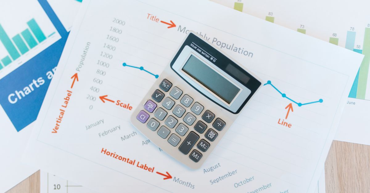
When the Workflow Fits Your Task
People searching for a way to convert a line graph to data usually have one of two goals: pull numbers out of an existing chart image, or take a small dataset and turn it into a clean, shareable chart they can drop into a slide, document, or report. The Line Graph Maker is built for the second goal. It is well suited to ordered sequences of measurements where the order of points matters and a connecting line makes the direction of change easier to see, such as monthly totals, weekly checkpoints, experiment readings, project milestones, classroom examples, or simple performance reports. It is not designed to recover data from a scanned or photographed chart; the input is a typed list of Label, Value rows, not a pixel image of an existing line. For chart-digitization work a separate optical tool is required; for ordered numeric datasets that should look like a line, this tool is a fast, private match.
Input Format and Parser Limits
The parser applies one simple rule: the last comma on a non-empty line separates its label from its value. This allows a label such as "New York, East" to contain an earlier comma and still parse correctly. Empty lines are ignored so you can space out your input for readability. Each value must be a finite, strict decimal or scientific notation number whose magnitude is at or below 1e12; empty labels, malformed numbers, Infinity, and out-of-range magnitudes are rejected and counted as invalid rather than plotted. The total typed input is capped at 50,000 UTF-16 code units, and at most 200 non-empty rows are processed per chart to keep the browser interaction responsive. Rows above that limit are skipped and reported separately next to the invalid-row count, so you always see exactly what was used to draw the line. At least two valid points are required, because a single point cannot form a line segment on its own.
Quick reference for accepted input
| Property | Accepted value or behavior |
|---|---|
| Row separator | The final comma on a non-empty line |
| Label content | Any text, including earlier commas; an empty label is invalid |
| Numeric forms | Integer, signed, decimal, zero, scientific notation such as 3.4e2 |
| Numeric limits | Finite and within magnitude 1e12; Infinity is invalid |
| Empty lines | Ignored |
| Total input cap | 50,000 UTF-16 code units |
| Rows per chart | Up to 200 non-empty rows processed |
| Skipped reporting | Invalid rows and over-limit rows counted separately |
| Minimum points | At least two valid points required |
Convert Labeled Data Into a Line Graph SVG
The conversion is a focused workflow: title, data, generate, download. The whole flow stays in your browser, so no upload is required and no account is involved. If your numbers already live in Excel, the guide to converting data to a line graph from Excel without uploading it covers the same tool with a spreadsheet-specific copy-and-paste path.
- Open the Line Graph Maker in your browser.
- Enter a concise chart title that describes the sequence, such as "Monthly Active Users" or "Lab Temperature, June 1-7".
- Type one row per data point using the format Label, Value, for example January, 124 or Jan 1, 3.4e2. The label can contain commas as long as the value sits after the final comma.
- Confirm you have at least two valid rows, since a single point cannot form a line segment.
- Click Generate. Inspect the axis range shown in the preview and read any explicit invalid-row or over-limit notice beside the chart.
- Verify the plotted order and that every expected point appears with the value you intended.
- Click Download to save the standalone SVG file. Open it in a browser, import it into a document, or attach it to a presentation.
Reading the Chart Before You Download
Two things deserve a careful look before exporting. First, the vertical axis uses a linear domain from the smallest valid value to the largest valid value, and it does not automatically start at zero. A reader who skims the chart can misjudge the size of a change, so make the displayed axis labels part of your interpretation. The axis labels retain practical significant digits and switch to scientific notation for very small or very large values, which is suitable for ordinary visualization but does not add measurement accuracy to the source data. Second, when every value in the dataset is identical, the tool expands the domain around that constant so the line remains visible in the middle rather than collapsing against a divide-by-zero range; that behavior is deliberate, but it can look like a flat line sitting in empty space if you do not notice it. Five evenly spaced horizontal reference lines and axis labels expose the displayed domain so the chart is never a blank rectangle with a single line.
Why the Output Is a Standalone SVG
The downloaded file is a single SVG document, an open vector image format maintained by the W3C and supported by every modern browser. Vector output means the chart stays sharp when resized, embedded in a slide deck, or printed, because the geometry is recomputed at render time instead of being rasterized at one resolution. The exported file includes the chart title, axes, horizontal grid lines, labels, the connecting line, point markers, and accessible point titles, so the file is self-contained and does not depend on any external font, script, or style sheet. If a publication requires a specific brand palette, typography, or accessibility treatment, edit the SVG in an appropriate vector tool after export. The SVG uses a white background and a blue line by default for broad compatibility, and the export viewBox is 800 by 480 so the chart remains stable across narrow and wide previews. For more on the format itself, the MDN SVG tutorial covers basic structure and the W3C SVG 2 specification covers the full feature set.
Line Graph vs Other Chart Choices
A line graph is the right pick when ordered points need to communicate direction and sequence, but it is not the right pick for every dataset. The table below summarizes how a small ordered dataset typically maps to chart choices; the exact figures for your data come from running the matching tool.
| Use case shape | Best fit | Why |
|---|---|---|
| Ordered categorical sequence such as months, weeks, or trial numbers | Line graph | Equal horizontal spacing and a connecting line show trend over an ordered axis. |
| Magnitude comparison across categories | Bar chart | Bar length makes category-to-category comparison direct without implying continuity. |
| Measured x and y pairs with unequal spacing | XY scatter plot | Scatter plots place points at exact x positions so distances carry meaning. |
| Part-of-whole composition | Pie chart | Slices show share of a total rather than sequence over an axis. |
| Single value or one-time snapshot | Table or text | A chart adds little when there is nothing to compare or sequence. |
Use Cases and What to Watch For
A line graph shows sequence and direction, not proof of causation or values between observations. Connecting two measurements does not establish that the underlying process changed smoothly in between, so the chart should be presented as a visual summary of the points you supplied rather than as evidence beyond them. The tool does not calculate a regression, forecast, moving average, confidence interval, statistical significance, error bar, or missing-value interpolation, and it does not sort rows automatically; arrange input in the intended order before generating. Keep the original dataset when exact source precision, uncertainty, or auditability matters, because rounded axis text can be shorter than the full internal number. Long labels can crowd the horizontal axis, especially on narrow screens; shorten labels or use fewer points if readability matters. Editing the title or data after a successful generation clears the generated output and disables the download button until the chart is generated again, which keeps the visible input and the visible chart in sync. If generation fails after a previous success, the earlier output is cleared instead of left on screen as if it represented the new input, so always review the replacement chart before using it elsewhere.
Related reading: How to Make a Table Chart From CSV.