A scatter plot generated from numeric x,y pairs is the most direct way to visualize paired observations taken from an image, a scanned chart, a measurement log, or a digitization step: paste one strict x,y pair per non-empty line into Scatter Plot Maker, and the tool turns those rows into an 800 by 500 SVG where each valid pair becomes one blue circle positioned by independent linear x and y scales. The displayed range is shown with five reference lines and labels on each axis, the parser reports valid, invalid, and over-limit rows as three separate counts, and the same percent-encoded SVG string that powers the on-page preview is offered as a standalone file you can save and open anywhere a vector viewer accepts SVG.
Searches for "convert image to scatter plot" usually arrive from one of three places: a chart or photo that already exists as a raster image and needs to become a working plot of its underlying measurements, a screen capture where someone wants to extract points and re-plot them on a controlled axis, or a list of pixel coordinates generated by another tool that needs to be visualized. The common requirement in each case is a clean numeric pair per point, and the Scatter Plot Maker is built specifically for that input shape, so the workflow stays focused on the numbers rather than on the source raster.
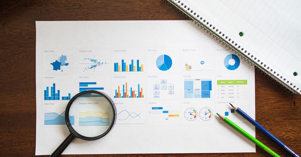
What converting an image to a scatter plot actually requires
A raster image cannot become a scatter plot directly inside the browser without first extracting numbers from it, because a scatter plot is a coordinate-based visualization and a PNG is a grid of pixels. What the tool consumes is the numeric layer underneath the image: one x value and one y value per observation. Once those pairs exist, whether they came from a hand-measured photo, a digitized calibration curve, or coordinates output by an image-processing step, they fit the same input shape, and the chart produced from them is what most readers actually mean when they search for an image-to-scatter conversion.
The output is a vector SVG, not another image, which means circles, gridlines, labels, and text stay sharp at any zoom level. SVG is an open standard for two-dimensional vector graphics maintained by the W3C, and the MDN SVG tutorial describes the same building blocks the chart uses: shapes, text, and attributes such as viewBox and preserveAspectRatio. Because the file is vector, the saved scatter plot can be opened in any SVG editor, embedded into a document, or printed without losing clarity.
The strict x,y format the parser expects
Input parsing is intentionally strict so that nothing the user pastes is misread as data. Every non-empty row must contain exactly two numbers separated by a single comma, with no units or surrounding text. Signed values, decimals, the literal zero, and scientific notation are accepted. Empty components, extra commas, unit text such as 5cm or 10kg, hexadecimal like 0x1F, the literals Infinity and NaN, and magnitudes with absolute value above 1e12 are all rejected as invalid rather than coerced to zero. Blank rows are skipped silently. Negative zero is normalized to plain zero. Total input is also capped at 50,000 UTF-16 code units, and any paste that exceeds that limit is rejected by the parser rather than silently truncated.
| Format example | Accepted or rejected | Reason given by the parser |
|---|---|---|
| 3,4 | Accepted | Two finite numbers separated by a comma. |
| -2.5, 1.75 | Accepted | Signed decimal with a fractional component. |
| 1e3,2 | Accepted | Scientific notation is finite and within magnitude limit. |
| 5, | Rejected as invalid | Empty second component fails the strict two-number rule. |
| 5cm,10cm | Rejected as invalid | Unit text is not a number. |
| 0x1F,2 | Rejected as invalid | Hexadecimal literals are not accepted as numeric input. |
| 1,2,3 | Rejected as invalid | Three components on a single row exceeds the two-number rule. |
Invalid rows are counted and displayed in the summary, never silently turned into zero points or shifted onto an axis, so the user always knows what their input actually contained rather than seeing a clean chart that hides bad rows.
Generate the scatter plot from your x,y pairs
- Open Scatter Plot Maker in the current browser tab and type an optional title that will appear on the chart and inside the SVG label.
- Paste your data into the input area with one strict x,y pair per non-empty line, in the exact format described in the previous section.
- Click the generate control so the parser runs through your rows, separates valid pairs from invalid rows, and tallies any extra rows above the limit.
- Read the summary block: the valid points count, the invalid rows count, and the over-limit rows count are reported as three separate numbers, including zero.
- Verify the displayed axis ranges by checking the five reference lines and labels on each axis, then inspect several representative points in the preview.
- Download the standalone SVG file when the preview matches what you want; the saved file is byte-identical to the preview because both come from the same percent-encoded SVG string.
Editing the title or the data clears that string and disables the old download, which prevents a stale chart from being saved after the input has changed.
Reading the valid, invalid, and over-limit counts
The summary always reports three numbers so that no row is hidden from the user. Valid points are the rows that became circles on the chart. Invalid rows are rows the parser tried to read and rejected because they did not match the strict format. Over-limit rows are non-empty rows beyond the first 200 that were deliberately not parsed. The two counts are kept separate on purpose: a row that failed because it contained text is a different problem from a row that was never examined because it fell past the boundary, and the summary preserves that distinction instead of merging them into a single hidden total.
If no valid point remains after parsing, the tool reports an error and clears any older chart rather than rendering an empty plot. Nothing is silently truncated or represented as if every pasted row had been used, so the user can always reconcile the chart with their original dataset.
How constant axes and overlapping points behave
Both axes use independent linear scales that map the smallest x value to the left plot boundary and the largest x value to the right, with the y axis handled in the same way from bottom to top. Values between those limits are placed in proportion to their numeric distance, which is why unequal numeric gaps remain unequal on the chart. The axes do not automatically include zero, so always read the labels before interpreting how spread out a cluster appears.
A constant axis is a special case that would otherwise divide by zero. When every x value is identical, the tool expands the x domain symmetrically around that constant by ten percent of its absolute value or one unit, whichever is larger, and centers every point horizontally. The same rule applies independently to a constant y value, so a single valid point ends up in the center of both axes instead of failing the layout. Overlapping points can hide one another, especially when identical pairs repeat, so inspect representative circles in the preview before relying on the visual count.
Verifying the chart before you rely on it
The chart is a visualization, not a precision-preserving data format. Coordinates in the SVG are rounded to three decimal places and axis labels use practical significant digits or scientific notation for very large and small values, so always keep the original rows for analysis, uncertainty estimates, and reproducibility. The tool does not calculate correlation, regression, a trend line, confidence intervals, error bars, density, clusters, or statistical significance; it only positions supplied pairs on linear axes and makes no statistical claim.
| Capability | Provided by Scatter Plot Maker |
|---|---|
| Independent linear x and y axes with explicit ranges | Yes |
| Vector SVG export at 800 by 500 | Yes |
| XML-escaped title visible in the SVG | Yes |
| Correlation, regression, or trend line | No |
| Logarithmic scales or categorical color grouping | No |
| Server upload of points or title | No |
For dense data, categorical color, accessible labeling, logarithmic scales, publication styling, or formal statistical analysis, use a dedicated plotting package while keeping the original dataset intact. The Scatter Plot Maker is best understood as the conversion step that turns an image's numeric pairs into a vector chart you can carry forward, not as a replacement for a full statistical workflow.
Related reading: Convert Scatter Plot to Heatmap from x,y Rows Online.
Related reading: Convert a YouTube Thumbnail to a Saved Image File.