Converting a scatter plot to a heatmap means transforming a list of individual (x,y) points into a density grid where overlapping regions are shaded by how many points fall there. The conversion typically happens in a statistics package that bins your data, counts points per bin, and paints each cell with a color gradient. Before any density calculation, however, you need a clean, verified set of x,y pairs and a way to see what they actually look like on a two-axis plane. That intermediate step is exactly what the Scatter Plot Maker produces: paste your rows, get an immediate 800 by 500 SVG scatter plot of every valid point, and download the exact preview as a standalone file. The tool checks up to 200 non-empty rows against strict numeric rules, reports invalid and over-limit rows as separate counters, and runs every operation in the current browser tab so nothing leaves your machine. It is a visualization, not a statistical engine, which makes it ideal for the inspection step that should sit between raw data and any density plot.
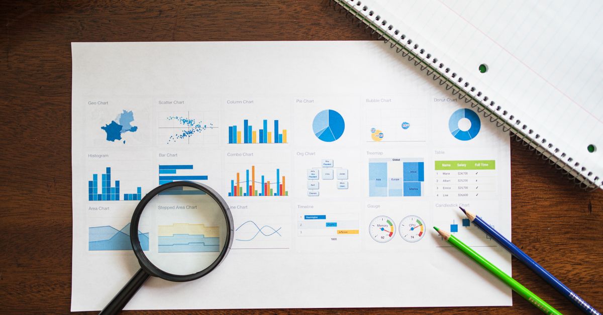
What "Converting a Scatter Plot to a Heatmap" Actually Means
A scatter plot treats every row as one marker on a plane; a heatmap collapses many overlapping markers into colored cells that represent counts, density, or another aggregated value. Converting between them therefore requires three operations that the Scatter Plot Maker does not perform: binning the plane into a grid, counting points per cell, and mapping counts to a color ramp. What the tool does is the prerequisite for all three: it confirms that each of your rows parses as a finite numeric pair, draws every valid point on independent linear axes, and gives you a sharable vector file you can reference while you build the density chart elsewhere.
Thinking of the conversion as a pipeline helps. Stage one is cleaning and validating x,y rows. Stage two is previewing them on a real axis so outliers, duplicates, and constant columns surface immediately. Stage three is feeding the cleaned list to a statistical package that produces the heatmap. This article covers stages one and two, because both happen in the scatter tool and both must be correct for the density conversion downstream to mean anything.
How to Plot Your x,y Data with the Scatter Plot Maker
- Type a title in the title field. The tool XML-escapes it before it appears in the SVG and in the accessible label, so ampersands, angle brackets, quotes, and apostrophes render as visible text rather than markup.
- Paste one pair per non-empty line in the form x,y. Signed values, decimals, zero, and scientific notation are accepted; blank lines are ignored.
- Click generate. The parser rejects any input above 50,000 UTF-16 code units in total and checks at most the first 200 non-empty rows for exactly two comma-separated finite numbers within absolute magnitude 1e12.
- Read the summary panel: it always lists valid points, invalid rows, and over-limit rows as three separate numbers, including zero. Rows past the 200-row boundary are not mixed into the invalid count because they were deliberately not parsed.
- Inspect the preview. The smallest x value lands at the left plot edge and the largest at the right; the smallest y value lands at the bottom and the largest at the top. Five reference lines and labeled tick marks expose each displayed range.
- Open the SVG to read the formatted x and y text inside each circle's title element. This is the exact numeric value the tool used, not a reconstructed approximation.
- Click download to save the identical 800 by 500 standalone SVG. Editing the title or data clears the cached SVG and disables the old download, so a fresh generate produces a fresh file.
Input Rules the Tool Enforces Strictly
The parser is intentionally unforgiving because silent corrections hide real problems. Rows that contain empty components, extra commas, unit text, hexadecimal, Infinity, or NaN are flagged as invalid and never become zero points or move to an axis. Magnitudes above 1e12 are rejected for the same reason. Negative zero is normalized to positive zero so two near-zero values do not appear on opposite sides of an axis. These rules mean that if your heatmap source data is dirty, the summary panel tells you exactly how many rows need cleaning before you feed them to a density tool.
| Format | Accepted | Example |
|---|---|---|
| Signed integer | Yes | -7,42 |
| Decimal | Yes | 3.14,-2.71 |
| Scientific notation | Yes | 1.5e3,2E-4 |
| Negative zero | Normalized to 0 | -0,0.5 |
| Hexadecimal | No | 0x1A,5 |
| Unit text | No | 10 kg,2 m |
| Infinity or NaN | No | Infinity,3 |
| Empty component | No | ,5 or 3, |
How the SVG Plot Maps Numbers to Position
Both axes use independent linear scales, so a gap of 10 units between two x values always occupies the same horizontal fraction regardless of where it falls on the axis. The smallest x value maps to the left boundary and the largest to the right; the smallest y value maps to the bottom and the largest to the top. Values between those limits are placed in direct proportion to their numeric distance. The axes do not automatically include zero, so a cluster that looks tight might be spread across a narrow numeric window. Always read the five labeled reference lines before interpreting apparent spread.
A constant column needs special handling because its minimum and maximum would be equal, and dividing by zero would make coordinates invalid. When every x value is the same, the tool expands the x domain symmetrically around that constant by ten percent of its absolute value or one unit, whichever is larger. The same rule applies independently to y. The expansion is what lets a single valid point appear in the center of both axes instead of failing the generation. After this expansion, coordinates are rounded to three decimal places in the SVG, and axis labels use practical significant digits or scientific notation for very large and very small values.
Common Pitfalls When Preparing Density Data
Overlapping points are the most common reason a scatter plot looks emptier than the source data. Identical pairs stack at the same coordinates and the second circle hides the first, which can make a dense cluster look like a single dot. This is also why a heatmap exists: it surfaces density that raw scatter markers cannot show. Before any conversion, scan the preview for repeated coordinates and decide whether to jitter them, deduplicate them, or accept the stacking.
A second pitfall is trusting axis positions without reading the labels. Because the tool does not include zero by default, a point near the bottom of the chart may have a large positive y value rather than a near-zero one. A third pitfall is treating the SVG as a precision-preserving file. Coordinates are rounded to three decimals, and the chart makes no statistical claim about correlation, regression, clusters, or significance. Keep the original rows for analysis, uncertainty, reproducibility, and exact values; the SVG is a snapshot for inspection and sharing.
Verifying Your Plot Before Density Conversion
Three checks should pass before the cleaned x,y list is passed to a heatmap function. First, both axis ranges match the smallest and largest values in your data, which the labeled reference lines expose directly. Second, the three counters in the summary panel add up to the number of non-empty rows you pasted: valid plus invalid plus over-limit equals your input. If invalid or over-limit is non-zero, decide whether to clean the source or accept the partial sample. Third, several point titles inside the SVG show the exact formatted x and y the parser accepted, and those should match the original rows character for character. If any check fails, edit the input and regenerate; the cached SVG is invalidated the moment you change the title or data.
When a Scatter Plot Is the Right Final Answer
Not every x,y dataset benefits from being converted into a heatmap. Small experiments, paired observations, calibration samples, classroom demonstrations, rough correlation checks, and quick visual inspections often communicate more clearly as raw points than as aggregated density cells. The Scatter Plot Maker is built for these cases: up to 200 strict pairs, three honest counters, a vector SVG download, and zero server round-trips. For dense datasets where color, logarithmic axes, accessible labeling, or formal statistical analysis matters, the right next step is a dedicated plotting package fed with the cleaned rows that this tool helped you confirm. Either way, the SVG you download here is the same percent-encoded data URI used by the on-page preview, so what you see is what you save.
For a deeper look, see How to Make a Story Plot Diagram in One Paragraph.
For a deeper look, see How to Make a Story Plot Interesting in 3 Steps.