To convert Excel data to a line graph, paste your Label, Value rows into a browser tool that builds the chart in your own browser and returns a standalone SVG you can download — no chart wizard, no plugin install, and no workbook upload. The Line Graph Maker does exactly this: it accepts up to 200 labeled points, reads one point per line as "Label, Value", places each label in entry order along the horizontal axis, scales the vertical position to the entered number, and connects adjacent points so the direction of change is visible at a glance. Every step — parsing, coordinate calculation, preview rendering, and download assembly — happens in the current browser, so the contents of your worksheet never travel to a server. The result is a clean SVG file, an open vector format defined by the W3C and explained in the MDN SVG tutorial, that stays crisp at any zoom level and opens in browsers, presentation tools, and most vector editors. For short ordered datasets — monthly totals, experiment readings, weekly counts, project milestones — this path replaces the heavier Excel chart workflow with a paste-and-download step.
Most people who type "convert excel to line graph" already have their data sitting in a spreadsheet. Two columns matter: a label column (months, regions, sample IDs, day names) and a value column (totals, measurements, percentages). The goal is rarely to build a reusable chart template; it is usually to produce a presentable line chart for a report, slide, or email attachment. A browser tool that ingests pasted rows removes the steps of inserting a chart object, picking a chart subtype, mapping ranges, and reformatting legends. It also avoids sending a workbook to an external converter when the data is sensitive, regulated, or simply too large to share casually.
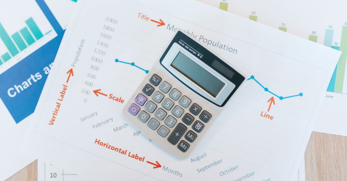
Copying Labeled Data From Excel for the Conversion
The data side of the conversion is straightforward once you know the input rule. The Line Graph Maker reads the last comma on each non-empty line as the separator between label and value, which means a label can contain an earlier comma. A row such as "New York, East, 42" parses as label "New York, East" and value 42. To move Excel data into that format, the safest path is to identify two adjacent columns: one for labels and one for numeric values, then rejoin them with a comma.
- In your worksheet, confirm that the label column and the value column sit next to each other, with no blank rows between them and no merged cells anywhere in the selected range.
- Select both ranges together (for example, column A for labels and column B for values) and copy them to the clipboard.
- Paste the clipboard into a plain text editor such as Notepad on Windows or TextEdit on macOS. Excel will paste the two columns as tab-separated columns.
- Use Find and Replace to convert every tab character into a comma. Running it twice is a safe way to catch any leftover tabs when labels and values contain extra spacing.
- Confirm that the last character on every non-empty line is the numeric value you expect, since that final comma is what the parser uses.
- Copy the combined lines back to the clipboard and paste them into the Line Graph Maker input area.
If your labels already include commas, leave them alone — only the final comma on each line acts as the separator. Numeric values can be positive, negative, zero, decimal, or written in scientific notation such as -3.14 or 1.5e-3, so leave minus signs and decimals exactly as Excel stores them. For a longer walkthrough of moving spreadsheet rows into this format without uploading the file, see this guide on converting Excel data to a line graph without uploading.
Building the Line Graph in Three Steps
Once your data is in Label, Value rows, the chart is built inside the Line Graph Maker with three short actions.
- Enter a concise chart title and add at least two rows in Label, Value format. One point per line, with the final comma on each line separating the label from the value. Two valid points is the minimum, because a single point cannot form a line segment.
- Generate the graph, then inspect the axis range and any explicit invalid-row or over-limit notice. The tool reports how many rows were skipped for being malformed and how many were skipped for being above the 200-row cap, so you can decide whether to fix the input or accept the partial chart.
- Verify the plotted order and values, then download the standalone SVG file. The download button stays disabled until a successful generation, which keeps the file aligned with the input you actually generated.
Editing either the title or the data after generation clears the on-screen chart and disables the download button until you regenerate. That behavior is deliberate: it keeps the visible chart and the downloaded file matching the exact input that produced them. If generation fails after a previous success, the earlier output is cleared rather than left on screen as if it represented the new input.
Valid Input, Invalid Input, and What Gets Skipped
The parser is strict about what it accepts, and reporting is explicit. The following table shows representative inputs and how the tool treats them.
| Row entered | Parsed as | Outcome |
|---|---|---|
| Jan, 12 | Label "Jan", Value 12 | Valid |
| New York, East, 42 | Label "New York, East", Value 42 | Valid (final comma separates) |
| Apr, 1.5e-3 | Label "Apr", Value 0.0015 | Valid (scientific notation) |
| May, -7 | Label "May", Value -7 | Valid (negative allowed) |
| Jun, | — | Skipped (missing value) |
| , 8 | — | Skipped (empty label) |
| Jul, Infinity | — | Skipped (non-finite value) |
| Aug, 1e15 | — | Skipped (magnitude above 1e12) |
| (blank line) | — | Ignored |
Input is also capped at 50,000 UTF-16 code units. Rows above the 200-row cap are not deleted silently — they are counted and reported separately beside the result so you can trim or split the dataset before publishing the chart. Invalid rows and over-limit rows are tallied in different categories, which makes it easy to fix only the rows that actually need attention. Blank lines are ignored, so stray returns between data rows do not waste capacity.
Reading the Generated Chart Before Downloading
A few details of the rendered chart are worth checking before the SVG leaves the browser. The vertical axis uses a linear scale from the smallest entered value to the largest entered value, and the axis does not automatically start at zero. Five evenly spaced horizontal reference lines expose the displayed domain. For ordinary change-over-time data this is helpful because small variations stay readable, but it can also exaggerate the apparent size of a change, so always glance at the axis labels before quoting the chart. When every value is identical, the tool expands the domain around that constant so the line remains visible in the middle rather than collapsing onto a single pixel.
Horizontal positions are equally spaced by row order. The first valid row sits at the left edge of the plot and the final valid row at the right edge, with intermediate rows dividing the distance evenly. This is appropriate for an ordered categorical sequence such as January through May. It is not appropriate when unequal time gaps or measured x distances must be preserved; for that case, use a plotting tool that supports explicit x and y columns. The labels are not interpreted as dates, so months written as names appear in the order you typed them rather than in calendar order.
The chart includes accessible point titles. Hovering or focusing on a marker in an SVG-aware viewer exposes the label and formatted value for that point. Numbers are handled with standard JavaScript double-precision arithmetic, and axis labels retain practical significant digits while using scientific notation for very small or very large values. The tool does not calculate a regression, forecast, moving average, confidence interval, error bar, or missing-value interpolation. The connecting line shows sequence and direction between the points you supplied, and nothing more, so the chart should not be presented as evidence beyond the observations you entered. Editing the title or data also clears the generated output and disables the download button until the graph is regenerated, which keeps the file aligned with what you can see.
When a Line Graph Is the Right Choice for Your Data
Line graphs shine for small ordered datasets where the eye needs to follow direction more than compare exact values. Typical fits include monthly sales totals, weekly sign-up counts, daily page views, project milestone dates with a percentage complete, classroom test scores across the term, and experiment readings taken at numbered steps. The Line Graph Maker is built for that scale: up to 200 points, no upload, a single click to generate, and a vector file that drops into a slide deck or document.
It is less suitable when the horizontal axis carries real distance (kilometers along a road, days with gaps), when the dataset has hundreds of series instead of one, or when statistical inference such as confidence intervals, error bars, or trend lines is part of the report. For those needs, switch to a spreadsheet's chart tool or a statistical package. For everything else, the conversion from Excel rows to a clean line graph is a short step once the Label, Value lines are ready, and the resulting SVG opens in browsers and most design tools without further conversion.
Related reading: Generate Random Dates in Excel From a Browser Tool.