The four common palm line labels used in Western palmistry are the Heart line, the Head line, the Life line, and the Fate line. These four names describe the conventional relative location and general direction of creases most often drawn on simplified palm diagrams: the Heart line sits as the upper horizontal line beneath the fingers, the Head line runs as the middle horizontal line just below it, the Life line curves around the base of the thumb, and the Fate line runs as the vertical center line traveling toward the middle finger. Only the Fate line is flagged as commonly absent, since many real hands do not show that vertical crease at all. These labels are descriptive labels only, meaning they name a position and a direction rather than a meaning. A practical way to see them placed is to use the Palm Reading Lines Guide, which highlights each of the four lines on an interactive simplified diagram and repeats the name, location, direction, and absence flag in a results panel without reading any photograph.
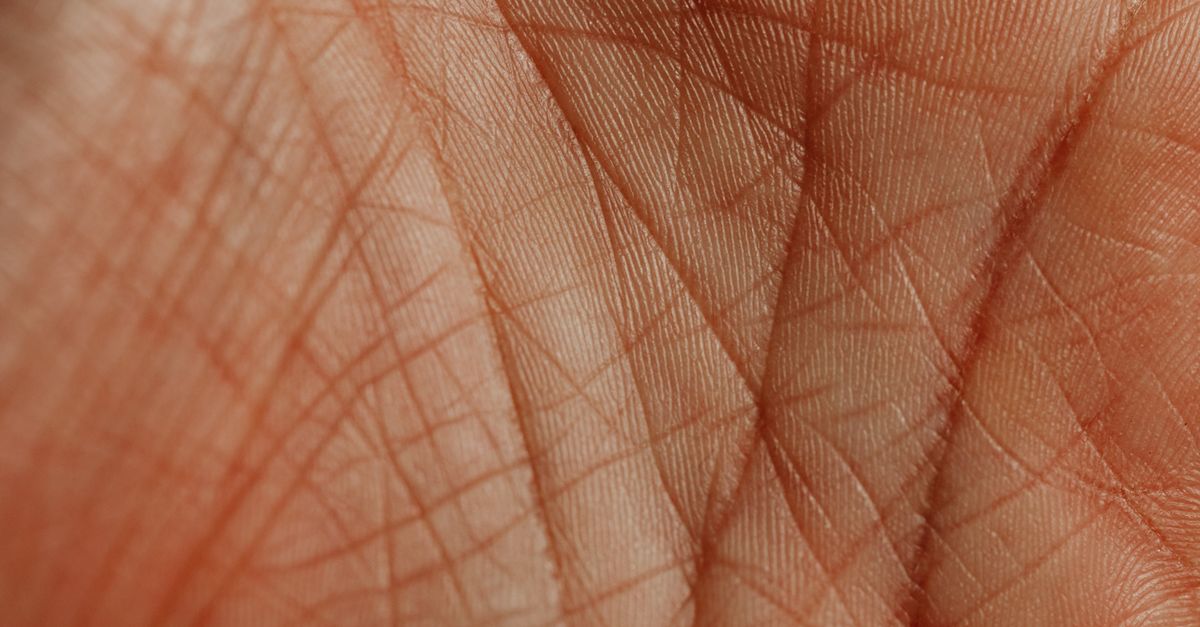
The Four Common Palm Line Labels and Their Positions
Western palmistry textbooks and modern reference pages consistently list the same four palm-line labels as the ones most readers encounter first: Heart, Head, Life, and Fate. The names are not interpretations of character or fate. They are short labels attached to four creases on a simplified hand diagram, and each one is defined by where it sits and which way it runs rather than by what it supposedly predicts. That distinction is what keeps the four labels useful as a shared vocabulary even when readers disagree about everything else.
Cheiro's public-domain Palmistry for All and modern guides such as Life Palmistry's beginner page all place these four lines in the same general regions of the palm. The shared topology is what survives across sources. Reading-order debates, character claims, and timing forecasts do not survive that cross-check, which is why a tool that limits itself to location and direction can stay accurate while a tool that adds meaning drifts into unsupported territory.
| Label | Relative Location | Direction | Commonly Absent |
|---|---|---|---|
| Heart line | Upper horizontal line beneath the fingers | Horizontal, below the bases of the fingers | No |
| Head line | Middle horizontal line below the Heart line | Horizontal, across the upper palm | No |
| Life line | Curved line around the base of the thumb | Curved, sweeping around the thumb mount | No |
| Fate line | Vertical line running toward the middle finger | Vertical, down the center of the palm | Yes |
The Fate row is the only one flagged as commonly absent because many real hands show no vertical crease in that center position at all. The other three creases appear on the great majority of diagrams, even when they branch, fork, or overlap with other marks. None of these labels is a measurement; each is a name for a relative position on the simplified hand.
How to Use the Palm Reading Lines Guide
The Palm Reading Lines Guide is built around these four labels and nothing else. It draws them on a simplified SVG palm and lets a reader select one label at a time to see exactly where the four conventional positions sit. The interaction is deliberately small: pick a label, read where it goes, and stop there.
- Choose Heart, Head, Life, or Fate with one of the four large buttons, or select the corresponding path directly inside the illustrative palm. Pointer, touch, Enter, and Space all activate the selection.
- Use the highlight to see the line's conventional relative position and general direction on the simplified diagram. The selected path receives a stronger visual stroke while the result panel repeats the name, relative location, direction, and the commonly-absent flag.
- Read the boundary note on the page before treating anything as a personal claim: the diagram is simplified topology only and provides no hand analysis, meanings, health claims, timing, predictions, or advice.
Each path has a 48-unit SVG hit stroke so the touch target stays close to or above the 44-pixel minimum even when the illustration shrinks on a narrow screen. Buttons inherit that same minimum height. The whole interaction happens in the current browser tab, and nothing about the selection is transmitted, stored, or attached to a profile.
Why the Guide Stops at Topology
Location and direction are the only two properties of a palm line that can be checked against more than one source. Meanings, on the other hand, vary wildly: historical plates and modern articles disagree about which line predicts which trait, in which order the lines should be read, and whether the Fate line even belongs in the same diagram. A tool that pretends to settle those debates would be inventing an authority the sources do not share. The Palm Reading Lines Guide refuses that move on purpose.
The boundary statement on the page is the contract: the diagram is simplified topology only, with no hand analysis, meanings, health claims, timing, predictions, or advice. That sentence is not a marketing hedge. It is the description of what the four-row table can honestly support. Personality, medical significance, years, dates, event timing, forecasts, and advice are all excluded because none of them can be derived from a name, a relative location, a direction, and a single absence flag. The Heart, Head, Life, Fate display order is labeled product display order, not a sourced reading sequence.
What Real Hands Do That a Diagram Cannot Show
Real palms branch, fork, overlap, and change with age. The simplified SVG geometry in the guide is original and explicitly labeled illustrative rather than anatomical. It is designed to give a reader a clean shared vocabulary for the four labels, not to certify that a specific crease on a specific hand is one of those four lines. Two adjacent creases can blend into what looks like a single thick mark. A short mark near the base of the thumb can be mistaken for a partial Life line. The guide does not pretend to settle those cases because it does not look at any hand image at all.
That is also why the page never asks for a photograph, a camera permission, a file upload, hand measurements, dominant-hand status, age, gender, or any other personal input. A location map for four labels has no need for those details, and adding them would only invite readers to treat the diagram as a verdict on a specific hand rather than a shared reference for four names.
Keyboard, Touch, and Narrow Screens
Because the four labels are the only thing the page does, the rest of the layout is built to keep that one task easy. A responsive grid stacks the illustration above the details on small screens. The SVG uses a viewBox and full-width scaling instead of fixed viewport pixels, so the diagram grows and shrinks with the column. Information cards allow text to wrap rather than clipping. Buttons inherit the site's 44-pixel minimum height, and every path supports pointer selection plus Enter and Space keyboard activation. Stable test identifiers cover the figure, paths, buttons, selected fields, and the Fate-only note so the interaction can be checked end to end without depending on visual cues alone.
For readers who want to keep their own notes alongside the diagram, the four labels in the result panel match the four rows in the table above and the four buttons on the page. The same vocabulary shows up in every part of the interface, which is the whole point of choosing location and direction as the only shared ground across sources. Anyone searching for the common palm line labels gets the same four names, in the same relative places, every time the page is loaded.
If you're weighing options, Use a Palm Line Diagram Without Uploading a Photo covers this in detail.
If you're weighing options, Do Pinnacle Number Age Ranges Predict Life Events? covers this in detail.