Use CMYK for print projects to ensure colors match professional presses, but preview them on-screen with an instant RGB converter to avoid surprises. CMYK (Cyan, Magenta, Yellow, Black) is the color model used by commercial printers to reproduce colors on paper. Unlike RGB (Red, Green, Blue), which is designed for digital screens, CMYK mixes ink percentages to create a wide range of hues. When you design in RGB and send it to print, colors often appear duller or shifted because printers can’t replicate the same brightness as screens. This mismatch can lead to reprints, wasted materials, and frustration. That’s where a CMYK to RGB converter comes in—it lets you see how your print colors will look on a monitor before finalizing your design. While this tool provides a quick preview, remember it’s an approximation. For projects where color accuracy is critical, like branding or photography, use an ICC-profile-aware application to ensure consistency across devices and print runs.
If you’re preparing a business card, flyer, or packaging, starting in CMYK from the beginning saves time and money. Many design tools, like Adobe Photoshop or Illustrator, allow you to set the color mode to CMYK before you begin. However, if you’ve already designed in RGB or received a file in that format, you’ll need to convert it. This is where the CMYK to RGB tool becomes useful. It helps you visualize the difference between the two models, so you can adjust your design accordingly. For example, a vibrant blue in RGB might turn into a muted teal in CMYK. By previewing the conversion, you can tweak the colors to get closer to your intended result before sending the file to the printer.
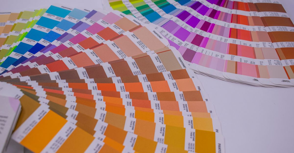
Why CMYK Is Essential for Print
CMYK is the industry standard for print because it aligns with how commercial presses work. Printers use four ink colors—cyan, magenta, yellow, and black—to create all other colors through a process called subtractive mixing. When you combine these inks, they absorb light, which is why CMYK colors often appear darker or less saturated than their RGB counterparts. RGB, on the other hand, is an additive model where colors are created by emitting light. This fundamental difference explains why a design that looks perfect on your screen might not translate well to paper. For instance, neon greens or bright reds in RGB can appear flat or muddy when printed in CMYK because printers can’t reproduce the same intensity of light.
Another reason to use CMYK for print is consistency. Professional printers calibrate their machines to CMYK standards, so files submitted in this format are more likely to match the final output. If you send an RGB file, the printer’s software will convert it to CMYK automatically, but this process can introduce unexpected shifts. For example, a logo designed in RGB might lose its vibrancy when printed, making it look washed out. By designing in CMYK from the start, you maintain control over how your colors will appear. This is especially important for projects with strict brand guidelines, like corporate reports or product packaging, where color accuracy is non-negotiable.
When to Use RGB Instead
While CMYK is ideal for print, RGB is the better choice for digital projects. If your design is meant for websites, social media, or presentations, RGB will give you the bright, vibrant colors that screens are capable of displaying. RGB’s wider color gamut allows for more saturated hues, which can make digital designs pop. For example, a gradient background in RGB will appear smooth and vivid, while the same gradient in CMYK might look banded or dull. This is why designers often create two versions of a project: one in CMYK for print and another in RGB for digital use.
There are also scenarios where you might need to convert CMYK to RGB, such as when you want to preview a print design on a screen. For instance, if you’re designing a brochure in CMYK but need to share a digital proof with a client, converting it to RGB lets them see an approximation of the final product. However, it’s important to note that this conversion is not perfect. The RGB preview will give you a general idea of the colors, but it won’t match the printed output exactly. For this reason, always include a disclaimer when sharing digital proofs, and encourage clients to request a physical sample if color accuracy is critical.
How to Preview CMYK Colors as RGB
- Open the CMYK to RGB converter in your browser. No installation or signup is required.
- Set the cyan, magenta, yellow, and black percentages to match your print design. Each channel accepts values from 0 to 100.
- Read the approximate RGB values and hexadecimal code displayed below the sliders. These represent how your CMYK color will appear on a screen.
- View the live color swatch to see a visual preview of the conversion. This helps you spot potential shifts before finalizing your design.
- Use the RGB or hex value in your digital proofs or presentations to show clients how the print colors will look on their devices.
- For projects requiring precise color matching, use an ICC-profile-aware application like Adobe Photoshop or Illustrator instead of this tool.
CMYK vs. RGB: Key Differences
| Feature | CMYK | RGB |
|---|---|---|
| Color Model | Subtractive (inks absorb light) | Additive (screens emit light) |
| Primary Use | Professional printing | Digital screens (websites, apps, presentations) |
| Color Range | Narrower gamut, less saturated | Wider gamut, more vibrant |
| File Formats | PDF, TIFF, EPS (for print) | JPEG, PNG, GIF (for web) |
| Best For | Business cards, flyers, packaging | Websites, social media, digital ads |
Pitfalls to Watch For
One of the most common mistakes designers make is assuming that RGB and CMYK colors will look identical. This misconception often leads to disappointment when a project is printed. For example, a bright yellow in RGB might appear orange or mustard in CMYK because printers can’t replicate the same intensity. To avoid this, always design in CMYK if the final output is print, and use the CMYK to RGB converter to preview how your colors will translate to digital screens. This way, you can adjust your design before sending it to the printer.
Another mistake is not checking the printer’s requirements. Different printers may have specific guidelines for file formats, color profiles, or resolution. For instance, some printers prefer PDF/X-4 files with embedded ICC profiles, while others accept TIFF or EPS files. Failing to follow these guidelines can result in color shifts or poor print quality. Always confirm the printer’s specifications before finalizing your design, and ask for a physical proof if you’re unsure about the colors. A proof is a small print sample that lets you see exactly how your design will look before committing to a full print run.
Finally, avoid relying solely on digital previews for color-critical projects. While tools like the CMYK to RGB converter are helpful for quick previews, they can’t account for variations in screen calibration or printer settings. If color accuracy is essential, such as for a brand logo or product packaging, invest in a professional color management system or consult with a print expert. This extra step can save you time, money, and frustration in the long run.
For designers who frequently switch between print and digital projects, understanding the differences between CMYK and RGB is crucial. Tools like the Color Contrast Checker can also help ensure your designs meet accessibility standards, whether they’re for print or web. By combining these tools with best practices, you can create designs that look great in any format.
See also: Convert RGB to HEX and Back in Your Browser Instantly.
For a deeper look, see Convert CMYK to RGB for Screen Preview in Your Browser.
For a deeper look, see Convert CMYK to RGB in Illustrator for Accurate Screen Previews.