
挑選能襯托藝術作品的相框顏色,首先要辨識影像本身的精確色調。與主色調衝突的相框會分散觀者對作品的注意力,而和諧搭配的相框則能營造精緻且具巧思的展示效果。挑戰在於將視覺色彩轉化為精確、實用的色碼——無論是訂製相框、搭配牆面顏色,或是與其他裝飾協調。這個 圖片取色器 正是為了解決這個問題:只要點選照片中的任何像素,即可顯示其精確的 HEX 與 RGB 數值。這種方式消除了猜測,確保您的相框顏色與藝術作品的色調完美契合。
舉例來說,一張以深綠與暖棕色為主調的風景照片,可能適合搭配柔和的橄欖綠或胡桃色相框。若沒有取色工具,您只能依賴「深綠」或「棕色」這類主觀的描述,而這類描述在不同製造商之間可能差異極大。同樣地,一幅以冷色藍與灰為主調的肖像畫,可能最適合搭配柔和灰色或銀色飾面的相框。圖片取色器提供精確的色碼,讓您能清楚傳達這些偏好,無論您是與裱框師、油漆供應商,或是線上訂製相框店家合作。
除了美感之外,色彩準確性對於無障礙設計也很重要。例如,患有色覺缺陷(如紅綠色盲)的人可能難以分辨某些色調。石原氏色盲檢測圖正是依賴精確的色彩對比來診斷這些狀況。雖然您的相框選擇不一定需要考量色盲因素,但了解藝術作品中的精確色彩能確保展示方式更具包容性。舉例來說,以紅色調的相框搭配以綠色為主的藝術作品,可能會對部分觀者造成視覺混淆。圖片取色器透過提供客觀的色彩數據,協助您避免此類衝突。
如何從藝術作品中取色
若要挑選與藝術作品搭配的相框�色,請依照下列步驟使用圖片取色器工具:
- 在瀏覽器中開啟 圖片取色器 頁面。
- 點選 瀏覽檔案 並從您的裝置中選擇藝術作品的圖片。相片會立即載入並保持私密——不會上傳到外部伺服器。
- 在圖片上移動游標以即時預覽色彩。工具會顯示游標所在像素的 HEX 與 RGB 數值。
- 點擊任何像素即可鎖定您想要的顏色。精確的 HEX(例如 #5A8C6D)與 RGB(例如 90, 140, 109)數值會顯示在即時色塊旁邊。
- 點選 複製 將 HEX 色碼儲存到剪貼簿。這在與裱框師或油漆供應商溝通時非常實用。
- 重複上述步驟以取樣其他顏色。工具會將您最近選取的顏色儲存在底部的歷史紀錄區,方便您並列比較。
挑選相框�色時該用 HEX 還是 RGB?
圖片取色器同時提供 HEX 與 RGB 數值,但挑選相框顏色時該使用哪一種?答案取決於您計畫如何應用這個顏色。HEX 色碼(例如 #4A6B8C)是六位數的英數字組合,常用於數位設計、網頁開發以及線上訂製相框工具。它們簡潔且易於分享,非常適合用來與線上零售商或設計師溝通。舉例來說,如果您要從一個允許輸入自訂顏色的電子商務網站訂購相框,HEX 是最直接的格式。
另一方面,RGB 數值(例如 74, 107, 140)更適合油漆配色或與本地裱框師合作這類實體應用。RGB 代表紅、綠、藍——也就是光的三原色——是印刷與製造產業的標準格式。如果您要前往五金行比對 DIY 相框的油漆顏色,請將 RGB 數值帶到油漆調色區。許多店家都有能將 RGB 轉換為其專屬配方的系統。同樣地,如果您委託本地工匠訂製相框,提供 RGB 數值能確保他們精準重現該顏色。
以下是協助您決策的快速比較:
| 使用情境 | HEX 色碼 | RGB 數值 |
|---|---|---|
| 線上訂購相框 | ✓ 最佳選擇 | ✗ 較少使用 |
| 在五金行比對油漆 | ✗ 不理想 | ✓ 最佳選擇 |
| 與設計師溝通 | ✓ 易於分享 | ✓ 也適用 |
| 與本地裱框師合作 | ✗ 很少使用 | ✓ 偏好格式 |
| 數位情緒板或模擬圖 | ✓ 標準格式 | ✓ 也可接受 |
挑選相框顏色時常見的錯誤
即使擁有正確的工具,挑選相框顏色時仍容易犯錯。最常見的錯誤之一,是選擇與藝術作品主色過於接近的相框。舉例來說,將泛褐色的照片裱在淺棕色相框中,會讓作品顯得平淡乏味。相框應該與作品形成對比或互補,而不是融入其中。圖片取色器能讓您從圖片中取樣多種顏色,協助您避免這個問題。如果主色調是暖棕色,可以考慮搭配冷灰色或白色相框,以營造視覺區隔。
另一個常見的陷阱是忽略房間現有的配色方案。一個在獨立看起來很出色的相框,可能會與它將要懸掛空間的牆面顏色、家具或其他裝飾產生衝突。在做出最終決定之前,請使用圖片取色器從房間本身取樣顏色。舉例來說,如果您的客廳有海軍藍的點綴,選擇金色或米色的相框可能比純黑或純白更合適。您甚至可以將房間的照片上傳到工具中,直接從中取樣顏色。
忽略藝術作品的情感基調也是常見的錯誤。顏色會引發不同的情緒,您的相框應該強化而非削弱作品的預期感受。舉例來說,一幅以大膽紅黃色調為主的活力抽象畫,若裝在亮白色相框中可能會顯得過於強烈,反而放大了視覺衝擊。改用柔和的灰色或黑色相框則能平衡作品,讓色彩更加突出。相反地,一幅色調柔和的水彩畫若裝在深色相框中,可能會讓作品失去輕盈感。這種情況下,淺色木質或米白色相框能保留作品的通透質感。使用圖片取色器取樣作品中最重要的顏色,並思考它們與您想傳達的氛圍是否契合。
不同藝術風格的相框搭配
不同的藝術風格需要不同的裱框方式,而正確的顏色能在尊重作品特色的同時提升其價值。對於傳統油畫,金色、黑色或深棕色等經典相框顏色通常效果最佳。這些色調能與作品的豐富質感與歷史感相得益彰。使用 圖片取色器 取樣畫作中最暖或最深的色調,然後選擇類似但稍柔和的相框顏色。舉例來說,如果畫作以深紅與金色為主,選擇霧面金或桃花心木色的相框會非常和諧。
另一方面,現代與抽象藝術通常適合極簡風格的相框,以免與作品的大膽色彩或動態構圖競爭。白色、灰色或黑色等中性色調是受歡迎的選擇,它們提供乾淨的邊框,讓藝術本身成為焦點。若要找到完美的中性色,請取樣作品中最亮與最暗的區域。如果作品有大面積留白,白色或淺灰色相框能創造無縫的視覺延續。如果作品色調偏暗或陰鬱,黑色或炭灰色相框則能增添戲劇張力。對於含有多種顏色的抽象作品,可以考慮選擇出現在作品背景或次要區域的色調作為相框顏色。
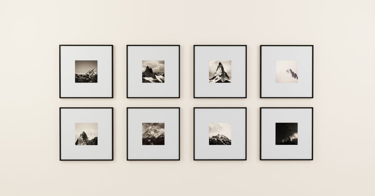
�影作品有其獨特的裱框考量。黑白照片裝在簡單的黑色或白色相框中通常格外引人注目,能彰顯其永恆的質感。至於彩色照片,相框顏色應與主色調相輔相成,而非蓋過風采。舉例來說,一張以翠綠與藍色為主調的風景照片,可能適合搭配柔和的藍�或鼠尾草色相框。使用圖片取色器取樣照片中最主要的顏色,然後選擇比照片明暗度略高一到兩階的色調作為相框。這種方式能創造和諧感,又不會過於直接地複製照片顏色而顯得生硬。
以下是不同藝術風格的相框顏色快速指南:
| 藝術風格 | 建議的相框顏色 | 應避免的顏色 |
|---|---|---|
| 傳統油畫 | 金色、黑色、深棕色、桃花心木色 | 亮白色、霓虹色、過於現代的色調 |
| 現代/抽象藝術 | 白色、灰色、黑色、柔和中性色 | 華麗金色、過於裝飾性的相框 |
| 黑白攝影 | 黑色、白色、銀色、淺灰色 | 鮮�顏色、繁複圖案 |
| 彩色�影 | 照片中的柔和色調、互補色 | 與照片色調衝突的顏色 |
| 水彩畫 | 淺色木質、米白色、柔和灰色 | 深色或厚重的相框、過於大膽的顏色 |
Using Color Theory to Choose a Frame
Color theory provides a framework for selecting a picture frame color that enhances your artwork. The most basic principle is the color wheel, which organizes colors into primary (red, blue, yellow), secondary (green, orange, purple), and tertiary hues. Colors opposite each other on the wheel—like blue and orange or red and green—are called complementary colors. These pairings create high contrast and visual interest, making them a bold choice for framing. For example, if your artwork features a lot of blue tones, a frame in a warm orange or terracotta could make the piece pop. Use the Image Color Picker to sample the dominant color in your artwork, then identify its complement on the color wheel.
Analogous colors, which sit next to each other on the wheel (e.g., blue, blue-green, green), create a more harmonious and subtle effect. These are ideal for artwork with a cohesive color palette, as the frame will blend seamlessly with the piece. For instance, a painting with shades of green and yellow might look beautiful in a frame with a soft olive or sage tone. To apply this principle, sample the primary and secondary colors in your artwork, then choose a frame in a hue that sits between them on the wheel.
Another useful concept is the 60-30-10 rule, a classic interior design principle that can also guide frame selection. The rule suggests that a room’s color scheme should consist of 60% dominant color, 30% secondary color, and 10% accent color. When choosing a frame, think of the artwork as the dominant color (60%), the wall as the secondary color (30%), and the frame as the accent (10%). For example, if your artwork is predominantly blue and the wall is a warm gray, a frame in a soft gold or white would serve as the perfect accent. Use the Image Color Picker to sample the dominant color in your artwork and the wall color, then select a frame that bridges the two.
Finally, consider the psychological effects of color. Warm tones like red, orange, and yellow evoke energy and excitement, while cool tones like blue, green, and purple create a sense of calm. Neutral tones like white, gray, and black are versatile and timeless. If your artwork is meant to be soothing, like a serene landscape, opt for a frame in a cool or neutral tone. If the piece is vibrant and dynamic, a warm-toned frame can enhance its energy. The Image Color Picker helps you identify the emotional tone of your artwork by revealing its exact color composition.
How to Test Frame Colors Before Committing
Before finalizing your picture frame color, it’s wise to test how it will look with your artwork in the actual space. One way to do this is by creating a digital mockup. Start by uploading a photo of your artwork to the Image Resizer tool to adjust it to the exact dimensions of the frame you’re considering. Then, use an image editing app or even a simple tool like Microsoft Paint to add a border in the color you sampled with the Image Color Picker. This gives you a rough idea of how the frame will interact with the artwork. For a more polished mockup, you can use free online tools like Canva or Figma, which offer templates for framing artwork.
If you prefer a physical test, visit a hardware store or frame shop that offers paint samples or frame swatches. Bring the HEX or RGB values you sampled with the Image Color Picker, and ask for a small sample of the closest matching paint or frame finish. Some stores may even let you take home a sample to test in your space. Tape the sample to the wall next to your artwork and observe how it looks in different lighting conditions—natural daylight, evening lamplight, and any overhead lighting. Colors can appear dramatically different depending on the light source, so it’s important to test under the conditions where the artwork will be displayed.
Another option is to use a virtual room designer tool, which many home decor retailers offer on their websites. These tools let you upload a photo of your artwork and “place” it in a virtual room with different frame colors. While the results aren’t always perfectly accurate, they can give you a sense of how the frame will look in context. Some tools even allow you to adjust the wall color and lighting to match your space. If you’re ordering a custom frame online, check if the retailer offers a similar feature. Many will let you preview your artwork in different frame styles and colors before you buy.
Related guide: How to Find Every Color in an Image (Exact HEX & RGB).
If you're weighing options, Compress Images in Photoshop or Instantly in Your Browser covers this in detail.
If you're weighing options, Crop Images in Google Slides or Directly in Your Browser covers this in detail.
If you're weighing options, Get Exact Color Codes from Images for Your Cricut Projects covers this in detail.