
Choosing a picture frame color that enhances your artwork starts with identifying the exact hues in the image itself. A frame that clashes with the dominant tones can distract from the piece, while one that harmonizes creates a polished, intentional display. The challenge lies in translating visual colors into precise, usable codes—whether for ordering a custom frame, matching a wall color, or coordinating with other decor. The Image Color Picker solves this by letting you click any pixel in a photo to reveal its exact HEX and RGB values. This eliminates guesswork, ensuring your frame color aligns perfectly with the artwork’s palette.
For example, a landscape photograph with deep greens and warm browns might benefit from a frame in a muted olive or walnut tone. Without a tool to sample those colors, you’d rely on subjective labels like “dark green” or “brown,” which can vary widely between manufacturers. Similarly, a portrait with cool blues and grays might pair best with a frame in a soft gray or silver finish. The Image Color Picker gives you the exact codes to communicate these preferences clearly, whether you’re working with a framer, a paint supplier, or an online custom frame shop.
Beyond aesthetics, color accuracy matters for accessibility. For instance, individuals with color vision deficiencies (like red-green color blindness) may struggle to distinguish between certain hues. Tools like the Ishihara color blindness test plates rely on precise color contrasts to diagnose these conditions. While your frame choice doesn’t need to accommodate color blindness, understanding the exact colors in your artwork ensures your display is inclusive. For example, pairing a red-toned frame with a predominantly green artwork could create visual confusion for some viewers. The Image Color Picker helps you avoid such clashes by providing objective color data.
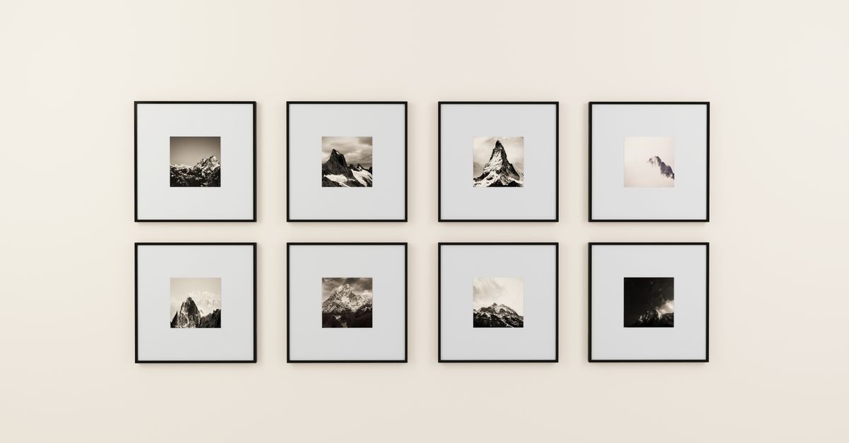
How to Sample Colors from Your Artwork
To choose a picture frame color that matches your artwork, follow these steps using the Image Color Picker tool:
- Visit the Image Color Picker page in your browser.
- Click Browse files and select the image of your artwork from your device. The photo loads instantly and remains private—no uploads to external servers.
- Move your cursor over the image to preview colors in real time. The tool displays the HEX and RGB values of the pixel under your cursor.
- Click any pixel to lock in the color you want. The exact HEX (e.g., #5A8C6D) and RGB (e.g., 90, 140, 109) values appear next to a live color swatch.
- Tap Copy to save the HEX code to your clipboard. This is useful for sharing with framers or paint suppliers.
- Repeat the process to sample additional colors. The tool saves your recent selections in a history strip at the bottom, so you can compare them side by side.
When to Use HEX vs. RGB for Frame Colors
The Image Color Picker provides both HEX and RGB values, but which one should you use for choosing a picture frame color? The answer depends on how you plan to apply the color. HEX codes (e.g., #4A6B8C) are six-digit alphanumeric values commonly used in digital design, web development, and online custom frame tools. They’re concise and easy to share, making them ideal for communicating with online retailers or designers. For example, if you’re ordering a frame from an e-commerce site that lets you input a custom color, HEX is the most straightforward format.
RGB values (e.g., 74, 107, 140), on the other hand, are better suited for physical applications like paint matching or working with a local framer. RGB stands for Red, Green, and Blue—the primary colors of light—and is the standard for print and manufacturing. If you’re visiting a hardware store to match a paint color for a DIY frame, bring the RGB values to the paint counter. Many stores have systems that can convert RGB to their proprietary color formulas. Similarly, if you’re commissioning a custom frame from a local artisan, RGB values ensure they can replicate the color accurately.
Here’s a quick comparison to help you decide:
| Use Case | HEX Code | RGB Values |
|---|---|---|
| Ordering a frame online | ✓ Best choice | ✗ Less common |
| Matching paint at a hardware store | ✗ Not ideal | ✓ Best choice |
| Communicating with a designer | ✓ Easy to share | ✓ Also works |
| Working with a local framer | ✗ Rarely used | ✓ Preferred format |
| Digital mood boards or mockups | ✓ Standard format | ✓ Also acceptable |
Common Frame Color Mistakes to Avoid
Even with the right tools, it’s easy to make missteps when choosing a picture frame color. One of the most common mistakes is selecting a frame that’s too close in tone to the artwork’s dominant color. For example, framing a sepia-toned photograph in a light brown frame can make the piece look washed out or monotonous. The frame should provide contrast or complement the artwork, not blend into it. The Image Color Picker helps you avoid this by letting you sample multiple colors from your image. If the dominant hue is a warm brown, consider a frame in a cool gray or white to create visual separation.
Another pitfall is ignoring the room’s existing color scheme. A frame that looks stunning in isolation might clash with the wall color, furniture, or other decor in the space where it will hang. Before finalizing your choice, sample colors from the room itself using the Image Color Picker. For instance, if your living room features navy blue accents, a frame in a complementary gold or cream tone might work better than one in a stark black or white. You can even upload a photo of the room to the tool and sample colors directly from it.
Overlooking the artwork’s emotional tone is another frequent error. Colors evoke different moods, and your frame should enhance, not undermine, the piece’s intended feeling. For example, a vibrant abstract painting with bold reds and yellows might feel overwhelming in a bright white frame, which can amplify the intensity. Instead, a muted gray or black frame could ground the piece and make the colors pop. Conversely, a delicate watercolor with soft pastels might get lost in a dark frame. In this case, a light wood or off-white frame would preserve the artwork’s airy quality. Use the Image Color Picker to sample the most prominent colors in the piece and consider how they align with the mood you want to convey.
Matching Frames to Different Art Styles
Different art styles call for different framing approaches, and the right color can elevate the piece while respecting its unique characteristics. For traditional oil paintings, classic frame colors like gold, black, or deep browns often work best. These tones complement the rich textures and historical feel of the artwork. Use the Image Color Picker to sample the warmest or darkest hues in the painting, then choose a frame in a similar but slightly muted tone. For example, if the painting features deep reds and golds, a frame in a burnished gold or mahogany would harmonize beautifully.
Modern and abstract art, on the other hand, often benefits from minimalist frames that don’t compete with the artwork’s bold colors or dynamic compositions. Neutral tones like white, gray, or black are popular choices, as they provide a clean border that lets the art take center stage. To find the perfect neutral, sample the lightest and darkest areas of the artwork. If the piece has a lot of white space, a white or light gray frame can create a seamless transition. If the artwork is dark or moody, a black or charcoal frame can add drama. For abstract pieces with multiple colors, consider a frame in a tone that appears in the artwork’s background or less dominant areas.
Photography presents its own set of framing considerations. Black-and-white photos often look striking in simple black or white frames, which enhance their timeless quality. For color photographs, the frame should complement the dominant hues without overpowering them. For example, a landscape photo with lush greens and blues might pair well with a frame in a muted teal or sage. Use the Image Color Picker to sample the most prominent colors in the photo, then choose a frame in a tone that’s one or two shades lighter or darker. This creates harmony without matching the colors exactly, which can look too literal.
Here’s a quick guide to frame colors for different art styles:
| Art Style | Recommended Frame Colors | Colors to Avoid |
|---|---|---|
| Traditional oil paintings | Gold, black, deep brown, mahogany | Bright white, neon colors, overly modern tones |
| Modern/abstract art | White, gray, black, muted neutrals | Ornate gold, overly decorative frames |
| Black-and-white photography | Black, white, silver, light gray | Bright colors, busy patterns |
| Color photography | Muted tones from the photo, complementary colors | Colors that clash with the photo’s palette |
| Watercolor paintings | Light wood, off-white, soft gray | Dark or heavy frames, overly bold colors |
Using Color Theory to Choose a Frame
Color theory provides a framework for selecting a picture frame color that enhances your artwork. The most basic principle is the color wheel, which organizes colors into primary (red, blue, yellow), secondary (green, orange, purple), and tertiary hues. Colors opposite each other on the wheel—like blue and orange or red and green—are called complementary colors. These pairings create high contrast and visual interest, making them a bold choice for framing. For example, if your artwork features a lot of blue tones, a frame in a warm orange or terracotta could make the piece pop. Use the Image Color Picker to sample the dominant color in your artwork, then identify its complement on the color wheel.
Analogous colors, which sit next to each other on the wheel (e.g., blue, blue-green, green), create a more harmonious and subtle effect. These are ideal for artwork with a cohesive color palette, as the frame will blend seamlessly with the piece. For instance, a painting with shades of green and yellow might look beautiful in a frame with a soft olive or sage tone. To apply this principle, sample the primary and secondary colors in your artwork, then choose a frame in a hue that sits between them on the wheel.
Another useful concept is the 60-30-10 rule, a classic interior design principle that can also guide frame selection. The rule suggests that a room’s color scheme should consist of 60% dominant color, 30% secondary color, and 10% accent color. When choosing a frame, think of the artwork as the dominant color (60%), the wall as the secondary color (30%), and the frame as the accent (10%). For example, if your artwork is predominantly blue and the wall is a warm gray, a frame in a soft gold or white would serve as the perfect accent. Use the Image Color Picker to sample the dominant color in your artwork and the wall color, then select a frame that bridges the two.
Finally, consider the psychological effects of color. Warm tones like red, orange, and yellow evoke energy and excitement, while cool tones like blue, green, and purple create a sense of calm. Neutral tones like white, gray, and black are versatile and timeless. If your artwork is meant to be soothing, like a serene landscape, opt for a frame in a cool or neutral tone. If the piece is vibrant and dynamic, a warm-toned frame can enhance its energy. The Image Color Picker helps you identify the emotional tone of your artwork by revealing its exact color composition.
How to Test Frame Colors Before Committing
Before finalizing your picture frame color, it’s wise to test how it will look with your artwork in the actual space. One way to do this is by creating a digital mockup. Start by uploading a photo of your artwork to the Image Resizer tool to adjust it to the exact dimensions of the frame you’re considering. Then, use an image editing app or even a simple tool like Microsoft Paint to add a border in the color you sampled with the Image Color Picker. This gives you a rough idea of how the frame will interact with the artwork. For a more polished mockup, you can use free online tools like Canva or Figma, which offer templates for framing artwork.
If you prefer a physical test, visit a hardware store or frame shop that offers paint samples or frame swatches. Bring the HEX or RGB values you sampled with the Image Color Picker, and ask for a small sample of the closest matching paint or frame finish. Some stores may even let you take home a sample to test in your space. Tape the sample to the wall next to your artwork and observe how it looks in different lighting conditions—natural daylight, evening lamplight, and any overhead lighting. Colors can appear dramatically different depending on the light source, so it’s important to test under the conditions where the artwork will be displayed.
Another option is to use a virtual room designer tool, which many home decor retailers offer on their websites. These tools let you upload a photo of your artwork and “place” it in a virtual room with different frame colors. While the results aren’t always perfectly accurate, they can give you a sense of how the frame will look in context. Some tools even allow you to adjust the wall color and lighting to match your space. If you’re ordering a custom frame online, check if the retailer offers a similar feature. Many will let you preview your artwork in different frame styles and colors before you buy.
Related guide: How to Find Every Color in an Image (Exact HEX & RGB).
If you're weighing options, Compress Images in Photoshop or Instantly in Your Browser covers this in detail.
If you're weighing options, Crop Images in Google Slides or Directly in Your Browser covers this in detail.
If you're weighing options, Get Exact Color Codes from Images for Your Cricut Projects covers this in detail.