To get a clean pie chart inside a PowerPoint slide, build the chart in your browser, download it as a PNG, and drop the picture onto the slide — the whole process takes about a minute and leaves no editable data table in PowerPoint for someone to accidentally break. PowerPoint can build its own pie chart from its Insert > Chart menu, and that route is fine when you need a live, editable object that updates when the underlying Excel sheet changes. For the majority of slide work — a quarterly breakdown, a survey snapshot, a percentage allocation that will not change between slide versions — a static PNG is faster and sturdier. You skip the chart's data table, the columns-and-rows interface, and the fussy formatting menus, and you get a finished, color-coded pie with a legend and percentages already in place. The image lands on your slide with a white background and crisp edges, and PowerPoint treats it the same way it treats any other inserted picture: you can resize it, send it forward or back, crop it, recolor it, or apply a frame, all from the Picture Format tab. The result looks the part on a projector and exports cleanly to PDF. The only trade-off is that the chart is no longer tied to a live data source — if the numbers change, you rebuild the PNG — but for charts that are meant to be a snapshot in time, this is the cleaner approach.
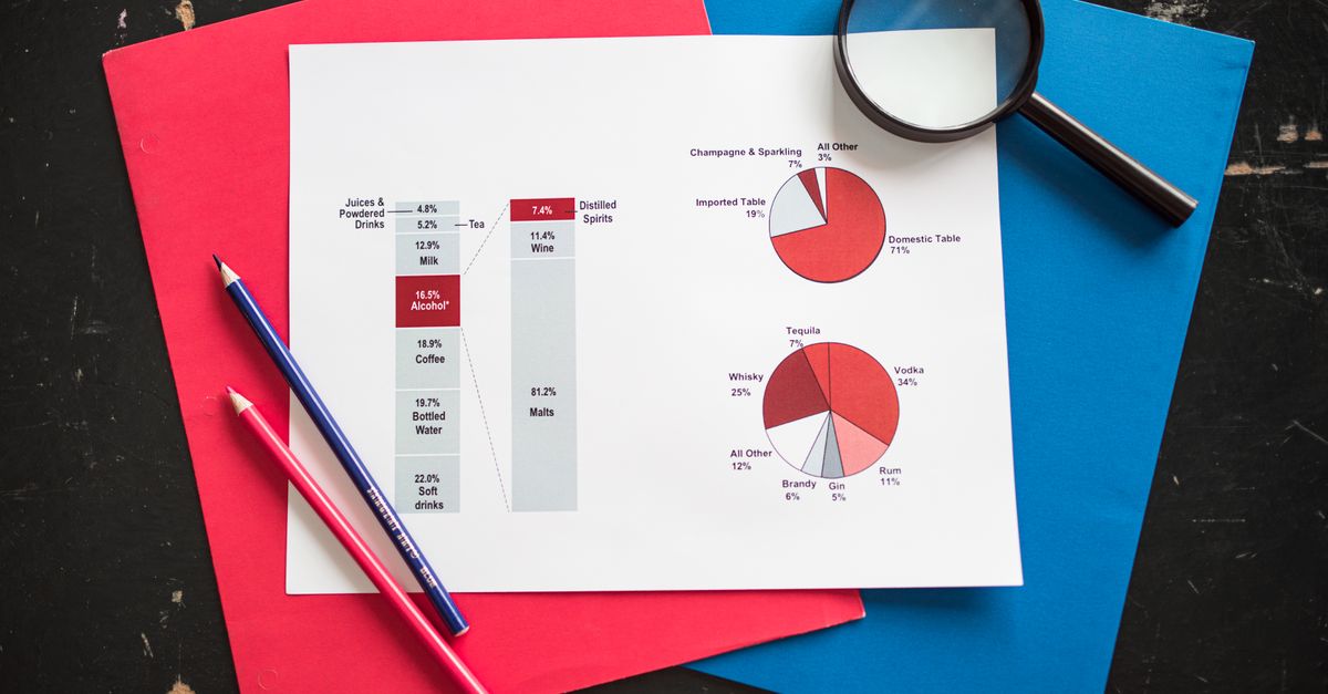
How to Make a Pie Chart in PowerPoint With a Browser PNG
The fastest way to run this workflow is a purpose-built browser tool that turns a plain list into a finished, color-coded pie chart and saves it as a PNG. Pie Chart Maker handles the whole loop locally — the chart is drawn on an HTML canvas inside your browser tab, so the PNG is generated on your device and the numbers never leave your computer. Here is the three-step route from a list of numbers to a PowerPoint-ready PNG.
- Type your data one item per line using the format Label, Value. For example, "Chrome, 63" on the first line and "Safari, 20" on the second. Blank lines are ignored, extra spaces are trimmed, and a category name that contains a comma still works because the tool reads the value from the last comma on the line. Whole numbers or decimals are accepted, and a value of zero is accepted — it just produces a slice with no visible width.
- Watch the chart redraw on the spot. Each slice is sized by its share of the total, given a distinct color from a built-in palette, and listed in a legend that shows the label, the raw value you entered, and the percentage. You do not need to pre-compute percentages yourself; the tool works them out from the numbers you provide.
- Optionally add a title that will appear above the chart — useful when the slide title is doing other work and the chart needs its own label. Click Download to save the chart as a PNG with a white background and crisp edges. The PNG file is what you drop into PowerPoint.
The whole edit-and-download loop runs locally. Nothing you typed is sent to a server, which makes it a safe place to handle internal numbers, draft budgets, or survey results that have not been published yet. You can tweak a number, watch the slice resize, and re-download as many times as you like before the slide is ready.
What the Pie Chart Looks Like Once It Is Built
The PNG that downloads is a self-contained image with a white background. Slices are drawn in the order you listed them, starting from the top of the circle, with each slice given a distinct color from a fixed palette so adjacent categories do not blend together. The legend shows three pieces of information for each category — the label you typed, the raw value, and the percentage share — so a reader does not need to do the math in their head. The percentages are calculated as each value divided by the sum of all values, which means the slices always add up to the whole even if the raw numbers do not. Because the chart is drawn from your numbers and not from a hidden template, you control what the legend says simply by adjusting what you typed in the input box.
Inserting the PNG Into Your PowerPoint Slide
Once the PNG is on your computer, the PowerPoint side of the job is a standard Insert Picture operation that takes only a few clicks.
- In PowerPoint, go to the slide where the pie chart should live.
- On the ribbon, choose Insert > Pictures > This Device (PowerPoint for Microsoft 365) or Insert > Pictures > Picture from File (older versions).
- Browse to the PNG you downloaded, select it, and click Insert. The picture drops onto the slide at its native size.
- Drag a corner handle to resize while keeping the aspect ratio, then position the chart where the layout needs it. Hold Shift while dragging a corner to constrain proportions.
- Open Picture Format on the ribbon to add a border, a soft shadow, or a Recoloring preset so the chart sits in with the rest of the deck.
Once it is on the slide, the PNG behaves like any other picture — it is part of the slide object tree and moves, groups, and aligns with the rest of your layout. If you copy the slide to a new section or to a different deck, the picture travels with it. What the PNG is not, however, is a live chart object: if the underlying numbers change later, you go back to the browser tool, update the values, download a fresh PNG, and replace the picture on the slide.
Browser PNG vs PowerPoint's Native Pie Chart
Both routes end with a pie chart on a slide — they differ mainly in the editing window between the data and the deck. The table below shows where each approach is the better fit.
| Aspect | Browser PNG (Pie Chart Maker) | PowerPoint Native Pie Chart |
|---|---|---|
| How the chart is built | Type labels and values in a text box; chart redraws as you type. | Insert > Chart > Pie; fill in the Excel data table PowerPoint opens. |
| Percentages | Computed for you from the values you entered. | Computed from the spreadsheet grid; you can edit formulas directly. |
| Live data link | None. The PNG is a static picture of the numbers you typed. | Linked to the embedded Excel sheet and edits in-place. |
| Formatting effort | Colors, slice order, and legend are decided by the tool. | Full control over colors, data labels, slice explosion, rotation, and chart styles. |
| Where the data lives | Only in your browser tab; nothing is uploaded. | In the embedded Excel sheet stored inside the .pptx file. |
| Best suited for | Snapshot charts that will not change after the slide is finalized. | Charts whose numbers will be revised during the review cycle. |
Pick the browser PNG when the pie chart is a fixed figure for one slide — a market share at a point in time, a budget breakdown, a survey result, a headcount snapshot. Pick PowerPoint's native chart when several slides share the same pie and must stay in lockstep as the data is revised.
Worked Example: A Three-Slice Share Breakdown
A pie chart only makes sense if the slices add up to 100%, but the numbers behind it rarely arrive that way. Here is a single run-through of three raw values, the math that produces the percentages, and the chart that comes out of it. Paste these three lines into the input box of Pie Chart Maker to reproduce the example:
- Chrome, 63
- Safari, 20
- Other, 17
Sum of values: 63 + 20 + 17 = 100.
Percentage for each slice = value ÷ sum × 100. So Chrome = 63 / 100 × 100 = 63%, Safari = 20 / 100 × 100 = 20%, and Other = 17 / 100 × 100 = 17%. The three slices add up to exactly 100%, which means the chart sits flush on the page with no gap or leftover ring.
If the numbers do not sum to 100 — for example 60 + 25 + 10 = 95 — the slice sizes still come from the values you typed (60 / 95, 25 / 95, 10 / 95), so the chart still looks correct. The legend simply reflects the share each value has out of the total you entered, and the slices together always total 100% of that sum.
Tips for a Slide-Ready Pie Chart
A pie chart that reads well on a slide is mostly a function of how the data is set up, not how the chart object is formatted. A handful of rules covers most cases.
- Group tiny categories into an "Other" row when the list has more than six or seven items. Pie charts lose readability quickly as the slice count grows, and a reader cannot distinguish a 1.4% slice from a 2.1% slice on a projector.
- Order the rows from largest value to smallest. Slices are drawn in the order you list them, so the biggest slice gets the 12 o'clock position and the eye lands on it first. Long, thin slices toward the end of a clock face are a common cause of unreadable pie charts in a meeting room.
- Keep labels short. Multi-word labels stretch the legend and force the chart to shrink so it still fits the slide. A two-word label ("Q1 Revenue") beats a sentence of context; put the long-form note in the chart title or the speaker notes instead.
- Use the chart title to state what the whole represents. "Share of browser sessions, March 2024" tells the reader what 100% means at a glance, removing the need to chase that detail in the body of the slide.
If you need a chart that compares magnitudes across categories rather than shows a share of a whole, a bar chart reads more cleanly. The workflow for that case is similar in shape: type the labels and values, get a finished PNG, drop it onto the slide.
When Privacy and Speed Actually Matter
Two practical reasons push this workflow further than convenience. First, because the chart is drawn on an HTML canvas in the browser tab and the PNG is generated locally, the numbers you paste are not sent to a server. Figures you would rather not upload — internal revenue splits, draft budgets, survey results before they are announced, headcount breakdowns — can go through the tool and into the deck without passing through anyone else's infrastructure. Second, the chart redraws as you type, so the loop of "tweak a number, see the slice change, tweak again" is immediate; there is no save, no render queue, and no waiting on a remote process. For a slide that needs to be ready before a meeting starts, that immediacy is the difference between finishing the chart during slide prep and finishing it after the deck has already been opened.
If you're weighing options, How to Make a Bar Chart in PowerPoint From Any List covers this in detail.
If you're weighing options, How to Make a Line Graph in Excel Without the Chart Wizard covers this in detail.