The standard conversion from RGB to CMYK works by dividing each RGB channel by 255 to get a decimal value between 0 and 1, then setting K (black) to 1 minus the largest of those three channels, with C, M, and Y calculated as the remaining color after removing that black component. RGB is an additive color model that combines red, green, and blue light, which is how monitors, phones, and cameras render color; CMYK is a subtractive model in which cyan, magenta, yellow, and black inks absorb light as they are layered on paper. Because the two color spaces are inverted in this way, the brightest and most saturated screen colors frequently become duller once printed, and certain vivid hues fall outside the CMYK gamut entirely and must be approximated rather than reproduced faithfully.
When designers search for "RGB to CMYK palette ideas," they usually have an existing screen palette, often built in HEX or RGB for a website, app, or social media design, and they need to prepare it for a flyer, poster, business card, or piece of packaging. The challenge is that a palette which looks balanced and vibrant on a monitor can shift in unexpected ways once converted, because individual channels respond differently to ink coverage, paper stock, and dot gain. An in-browser RGB to CMYK Converter removes the math from the process so you can evaluate each swatch in your palette and decide which colors to keep, which to adjust, and which to swap before sending the file to a printer.
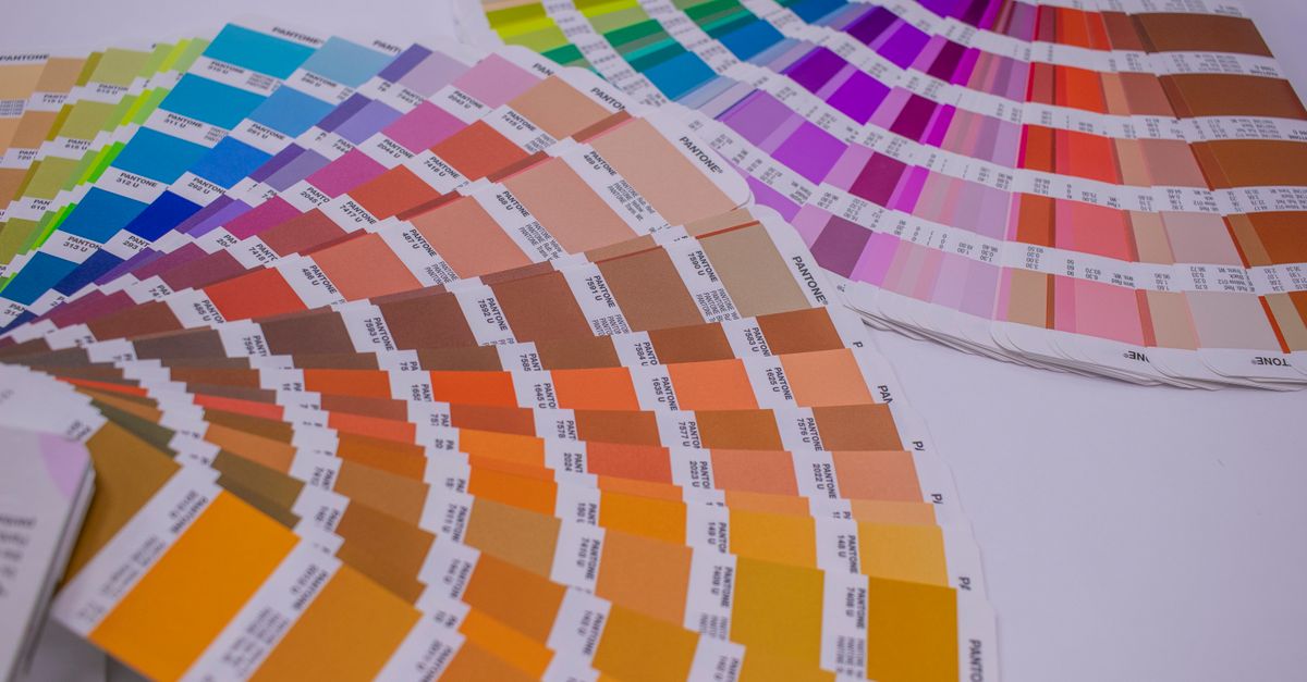
Why RGB Palettes Shift When Printed
RGB and CMYK describe the same color differently because they were built for opposite ends of the design pipeline. RGB mixes light, so adding more red, green, and blue makes colors brighter and more saturated, and combining all three at full intensity produces white. CMYK mixes pigment, so adding more cyan, magenta, yellow, and black absorbs more light and makes colors darker, with all four at full coverage moving toward black on paper.
This inversion creates three predictable effects that any palette must absorb when it moves from screen to print. First, saturated screen hues lose some of their punch because CMYK inks cannot reach the same brightness as backlit pixels. Second, cool-leaning colors such as blues and purples often darken more than warm-leaning colors like reds and oranges once they are converted. Third, highly saturated yellows, oranges, and greens that look balanced on a monitor can turn muddy once the K component is added during the conversion.
The practical takeaway for palette ideas is that you should not simply convert a screen palette mechanically and assume the printed output will look the same. The conversion gives you a defensible starting point, but the design decision about which colors will hold up under ink coverage still belongs to you. A deeper walkthrough of why the conversion behaves this way is covered in the guide on RGB to CMYK explained, which goes into the model inversion in more detail.
Convert a Screen Palette to CMYK in Your Browser
- Open the RGB to CMYK Converter in your browser. The tool runs without sign-up and processes everything locally, so no color values are uploaded.
- For each color in your screen palette, enter the RGB values using the channel fields, with each channel set between 0 and 255. Out-of-range inputs are clamped automatically, so the converter always returns a usable result rather than a broken one. If you only have a HEX code, enter the equivalent red, green, and blue channels.
- Read the CMYK percentages that appear in the output panel, then look at the live color swatch preview to confirm the converter returned the color you intended.
- Note the HEX value alongside the CMYK output if you need the original screen code for documentation, or for re-importing the color back into a web design tool.
- Click Copy next to whichever output format you need (CMYK percentages, RGB, or HEX) and paste it into your print file, brand guide, or production sheet.
- Repeat the same steps for every swatch in your palette so each one gets a paired RGB and CMYK value you can reference later.
Because the tool also converts the other direction, you can paste CMYK percentages from a printer's spec sheet and preview roughly how that color will appear on a screen. This is useful when a print brand guideline specifies CMYK and you need to see how close it gets to the on-screen brand color before producing a mockup.
Color Families That Translate Well Between RGB and CMYK
Some palette ideas start with hue families that survive the screen-to-print journey with very little shift. These tend to be muted, earthy, or deep tones rather than neon brights, because CMYK inks can reproduce their wavelengths closely without forcing large gamut compromises.
| Hue family | Why it prints well | Example use in a palette |
|---|---|---|
| Deep navy, charcoal, ink blue | Low channel values plus moderate K reproduce cleanly on coated and uncoated stock. | Background or anchor color for editorial and corporate palettes. |
| Warm earth tones (terracotta, brick, ochre) | High yellow and moderate magenta values stay rich without large K coverage. | Accent colors in lifestyle, hospitality, and food packaging palettes. |
| Forest, olive, moss greens | Lower-saturation greens stay legible once the K component is added. | Supporting tones for outdoor, sustainability, and natural-product palettes. |
| Burgundy, plum, wine | Muted reds with magenta dominance convert without large gamut loss. | Anchor colors for premium, fashion, and wine-and-spirits palettes. |
| Cream, ivory, warm white | Near-zero K and low CMY reproduce cleanly on uncoated stock. | Background or paper-saving color for stationery and book interiors. |
If you build a palette around one or two of these families, the conversion will usually hold its character. Designers who want a more sophisticated take on palette ideas can also generate a starting set of swatches with the Color Palette Generator and then convert the entire set into CMYK with the same tool.
Color Families to Use Carefully in Print
Not every screen color makes a reliable palette member once it reaches a press. Some hue families look excellent on a monitor but lose so much of their identity in CMYK that they should be replaced rather than converted.
| Hue family | What happens in CMYK | Palette idea |
|---|---|---|
| Neon yellow, lime, electric green | Falls outside the CMYK gamut and prints as a duller chartreuse. | Pick a slightly desaturated RGB value, not the neon you see on screen. |
| Electric blue, royal cyan, sky-on-screen | Bright blues darken noticeably and may shift toward purple. | Pick a deeper, slightly desaturated RGB so the print stays recognizably blue. |
| Hot magenta, fuchsia, neon pink | Saturated magentas lose vibrancy and can pick up unwanted K warmth. | Anchor with a deeper burgundy or wine, and keep neon pink for accents only. |
| Bright tangerine, neon orange | Out of gamut, so it prints as a flatter orange or brown. | Use a warm coral instead, and reserve neon oranges for screen-only assets. |
For any color in this second group, the converter will still produce a CMYK percentage, but the printed swatch will look noticeably different from the on-screen swatch. Treat the conversion as a sanity check rather than a guarantee, and lean toward replacement over adjustment for any neon or electric hue.
A Worked Conversion: Steel Blue
To see the formula in action, take steel blue with RGB(70, 130, 180). Scaling each channel to a 0–1 range gives R' = 0.275, G' = 0.510, and B' = 0.706. K is calculated as 1 minus the largest of those three values, which is 1 − 0.706 = 0.294. C, M, and Y are then (1 − R' − K) / (1 − K), (1 − G' − K) / (1 − K), and (1 − B' − K) / (1 − K). Because B' is the largest of the three channels, the Y term (1 − B' − K) / (1 − K) drops to zero, and the final CMYK rounds to roughly C=61, M=28, Y=0, K=29. That print-friendly set, with no yellow ink at all, is exactly why steel blue is a reliable palette anchor for editorial and corporate work.
Building a Print-Ready Palette From a Screen One
Once you have a rough CMYK reading for each swatch, the practical workflow is to compare the converted values against the look you actually want on paper. Run every screen color through the converter, then sort the swatches into three buckets. Keep the colors whose CMYK reading produces a swatch that still matches the original mood, and use these directly in the print file. Adjust the colors whose CMYK reading shifts the hue or value too much by tweaking the RGB input in the converter until the printed swatch preview lands where you want it. Replace the colors whose CMYK reading flattens or muddies the swatch by swapping them for a palette idea from the "translate well" table and re-running the conversion.
This triage turns the conversion from a passive math step into an active design decision, and it produces a print-ready palette without needing to reopen your design software or rebuild the color list from scratch.
When the Converter Is Enough, and When You Need a Printer Profile
The naive RGB-to-CMYK math that this tool uses is excellent for quick estimates, for understanding how the two models relate, and for choosing a sensible starting palette. It is not ICC color management, which is what a real print shop applies when it converts a file through a profile such as US Web Coated SWOP, FOGRA39, or Japan Color. Those profiles account for the actual inks, paper, and dot gain of a specific press, and the percentages they produce will sometimes differ noticeably from the naive result.
Use this converter for mockups, internal reviews, brand-guideline drafts, and any pre-production stage where you want a fast, defensible CMYK starting point. For final press-ready files, trust your printer's profile and a printed proof. The two workflows are complementary, not competing, and combining them is how you turn a screen palette into a printed result that still feels like the original design.
Related reading: RGB to HEX Formula: The Math Behind the Conversion.