A color gradient in InDesign is a visual fill, stroke, or text effect that smoothly blends two or more colors across an object using a Gradient Swatch, with adjustable stops, midpoints, and angle controls inside the Swatches panel — and the same blend can be carried straight onto the web as one line of CSS using the Color Gradient Generator.
InDesign treats gradients as a type of swatch, sitting right alongside your solid colors, tints, and mixed inks. That distinction matters: a gradient behaves like any other color resource in your document. You can save it to the Swatches panel, share it across linked files, edit it once and have it update everywhere it is used, and apply it to objects, frames, or even individual characters of text. Designers reach for gradients when a flat color feels flat, when they want to add depth to a hero spread, or when they need a subtle background that does not compete with body copy.
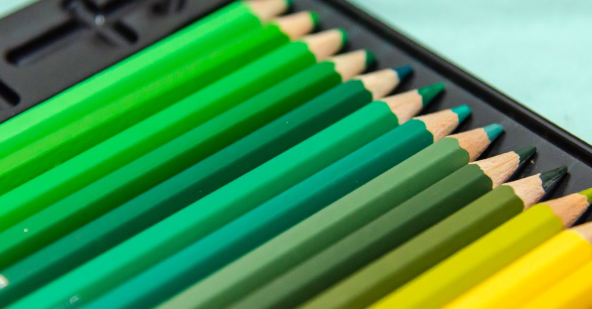
What a Color Gradient Does in InDesign
Behind the scenes, a gradient is a list of colors laid along a line (or radiating from a center) with the software filling in every pixel between them. InDesign represents this as a swatch you can name, edit, and reuse. Each swatch contains at least two color stops, plus optional midpoints that control how abruptly one color hands off to the next. Push a midpoint toward the 50% mark and the transition feels balanced; slide it close to one stop and the blend snaps faster near that color.
Three controls shape every InDesign gradient:
- Type — Linear (a straight line across the object) or Radial (a circular blend from a center point).
- Color stops — The individual colors in the blend; each has a position from 0% to 100% along the gradient axis.
- Midpoints — The percentage halfway between two consecutive stops where the average color is held before the next blend begins.
You can also toggle the gradient direction on an object using the Gradient Swatch Tool — drag across the object to redefine the angle and length of the blend without rebuilding the swatch from scratch.
How to Apply a Gradient in InDesign
- Open the Swatches panel from Window > Color > Swatches.
- Click the panel menu (the small lines in the top-right corner) and choose New Gradient Swatch.
- In the New Gradient Swatch dialog, set the Type to Linear or Radial depending on the direction you want.
- Click the color stops beneath the gradient bar and assign a color to each from your swatch library or the Color Picker.
- Drag each stop's position slider to control where that color sits along the blend, and adjust the midpoint diamonds between stops to shape the transition speed.
- Name the swatch and click OK; the new gradient appears in your Swatches panel and is ready to use.
- Select an object, frame, or text range, then click the gradient swatch in the Swatches panel to apply it as the fill, or drag it onto the stroke indicator to apply it to an outline.
- Switch to the Gradient Swatch Tool (G) and drag across the object to adjust the angle, length, and center of the applied gradient in real time.
The same workflow covers type: select the characters with the Type tool, then apply the gradient swatch as the fill. InDesign paints the blend across the selected glyphs, which is the standard trick behind magazine pull-quotes and logo-style headings. To restrict the effect to part of a sentence, highlight only those characters first — the gradient respects the selection.
Linear vs Radial Gradients: When to Pick Each
The two gradient types in InDesign map directly onto the two CSS gradient functions used on the web, so the choice you make in print tends to translate cleanly into a digital workflow. This table lays out the practical differences:
| Property | Linear gradient | Radial gradient |
|---|---|---|
| Direction | Straight line along an angle you set (0deg up, 90deg right, 180deg down) | Outward from a central point in a circular pattern |
| Best for | Hero backgrounds, section dividers, button fills, image overlays | Spotlights, glow effects, soft vignettes, glassy badges |
| Typical stops | 2 to 4 colors along one axis | 2 to 3 colors radiating from the center |
| CSS equivalent | linear-gradient(angle, color1, color2, ...) | radial-gradient(circle, color1, color2, ...) |
| Scales crisply on screen | Yes — pure CSS, no image asset needed | Yes — pure CSS, no image asset needed |
Pick linear when you want a calm, directional feel — most landing-page hero backgrounds fall into this bucket. Pick radial when you want a focal point or a soft glow that draws the eye to a single spot, like a button that appears lit from behind. When in doubt, build the print layout with the simpler type and revisit the angle before exporting.
Build a Matching Web Gradient with the Color Gradient Generator
Print layouts often end up on the web eventually — a brochure becomes a landing page, a magazine ad becomes a hero banner. The fastest way to keep the colors consistent between the InDesign artwork and the digital version is to drop the same hex values into a CSS gradient. The Color Gradient Generator handles the syntax, the angle math, and the stop ordering for you, and the final output is one line of CSS you paste straight into a stylesheet.
Here is the exact workflow:
- Open the Color Gradient Generator and pick a gradient type — Linear for a directional fade or Radial for a center-out blend.
- Set each color stop's color by pasting the same hex values you used in InDesign, then drag the position slider for each stop until the visual matches your printed swatch.
- For linear gradients, adjust the angle slider so the direction lines up with the InDesign gradient bar; 0deg points to the top, 90deg to the right, 180deg to the bottom.
- Add or remove stops as needed; the tool sorts them by position automatically and clamps every value into the valid 0–100% range, so the CSS it prints is always syntactically correct.
- Watch the live preview update as you make changes — the rendered swatch is the exact result the browser will produce.
- Click Copy CSS and paste the background declaration directly into your stylesheet.
Because every gradient is defined by color stops, you can recreate multi-band blends by adding a third or fourth stop — for instance, holding a brand accent at exactly 50% so the gradient passes through that color instead of running straight from start to end. The tool keeps every stop ordered correctly no matter how you edit, so even a five-stop blend looks the way you intended when it ships.
Picking Colors That Translate Between Print and Screen
A few small habits keep gradients consistent once a design moves out of InDesign:
- Use hex values in both tools. InDesign's Color Picker can show a color's hex equivalent; pair that hex with the Color Gradient Generator so the screen render matches what you saw on the swatch panel.
- Anchor the gradient on a single brand color. Letting one stop equal a recognizable brand hue makes the gradient feel intentional rather than random, on screen and on paper.
- Name and save the swatch. Whether it lives in InDesign's Swatches panel or as a CSS custom property, naming the gradient saves you from rebuilding it every time.
If you need fresh palettes to feed the gradient, the Color Palette Generator builds complementary, analogous, and triadic sets from any base color, and the Random Color Generator hands you a quick hex when you are stuck and want to explore. Combined with the gradient tool, you can move from a printed InDesign layout to a working web version in one sitting, with the same colors appearing in both places.
For a deeper look, see Linear vs Radial CSS Gradients: When to Use Each.
For a deeper look, see Color Gradient Generator Alternative: A Local Browser Tool.