A CSS color gradient is a smooth transition between two or more colors produced by the browser through the linear-gradient() or radial-gradient() CSS function, with each stop positioned on a 0–100% scale along the gradient line. The simplest way to get one is to choose a gradient type, set your colors and their stop positions visually, and copy the generated background declaration straight into your stylesheet. That approach removes the trial-and-error of hand-writing color values and angles, and the Color Gradient Generator is built for exactly this workflow: pick stops, preview live, then click to copy production-ready CSS.
Gradients show up almost everywhere in modern web design. Hero sections, buttons, cards, charts, and even text outlines use them to add depth without extra image files. Because a gradient in CSS is just a value inside background-image, it scales to any screen size with no quality loss and a tiny file footprint. The catch is that writing the syntax by hand — angles, stop positions, color formats — is easy to get wrong, and a misplaced percent sign or color value produces a flat color or a banding artifact. Visual tools turn those fiddly values into something you can drag and adjust in real time.
If you prefer writing the gradient by hand, the underlying syntax is well documented on the MDN CSS images module. But for most projects, the practical move is to build it visually and copy the result. Below is the full workflow, plus how to choose between linear and radial, when to add extra stops, and how to verify the gradient still meets accessibility rules.
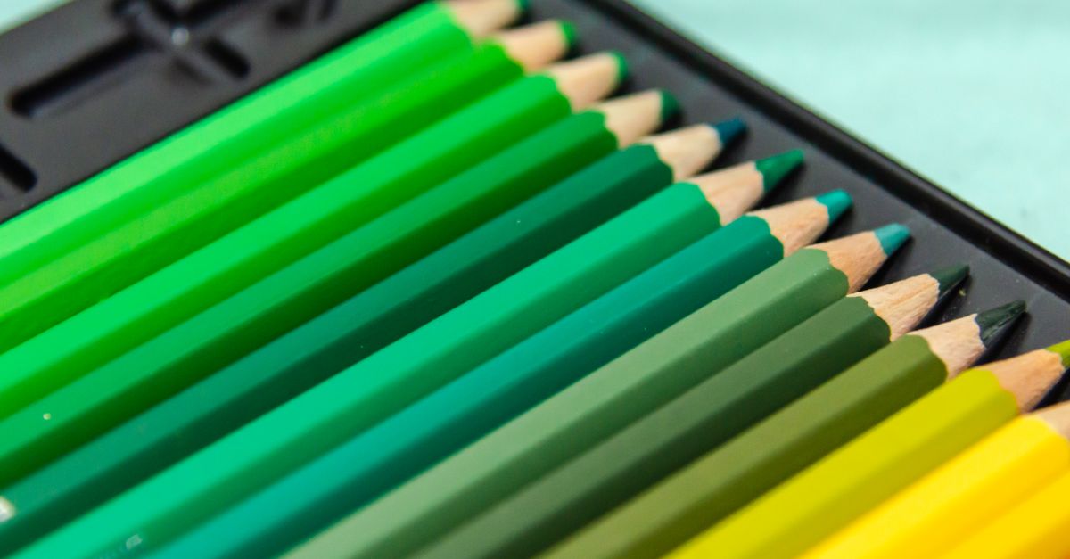
Linear vs Radial: Which Gradient Fits Your Design
Before you start picking colors, decide how the gradient should flow. The two CSS gradient types serve different visual goals, and the right choice depends on the shape of the container and the mood you want.
| Gradient type | Direction | Best for | Typical CSS function |
|---|---|---|---|
| Linear | Along a straight line, controlled by an angle (e.g. 90deg, to right, 45deg) | Banners, buttons, text backgrounds, sections that need a sense of motion or direction | linear-gradient(angle, color 1, color 2) |
| Radial | Outward from a center point (defaults to the element's center) | Spotlights, badges, circular avatars, soft vignettes | radial-gradient(shape, color 1, color 2) |
| Conic | Sweeping around a center point | Color wheels, charts, decorative borders | conic-gradient(from angle, color 1, color 2) |
For most page-level backgrounds and call-to-action buttons, a linear gradient is the safer choice because the direction reads clearly across wide screens. A radial gradient can feel more dramatic but tends to anchor visually to one point, which sometimes fights the rest of the layout. The CSS gradient guide walks through the syntax differences if you want to compare them side by side.
Build Your Gradient Step by Step
The reliable workflow is to set up the gradient visually, preview it, and then copy the CSS. Follow these steps in order using the Color Gradient Generator.
- Open the Color Gradient Generator and choose a gradient type: Linear for a directional fade, or Radial for a center-out blend.
- Pick your first color by entering a HEX value, using the color picker, or pasting a value you already have (see RGB to HEX if you need to convert formats first).
- Adjust the position slider for the first stop. Each stop lives on a 0–100% scale, where 0% is the start of the gradient and 100% is the end.
- Click Add Stop to create a second color, set its hex value, and drag its slider to control where the transition lands. Two stops produce the classic two-color fade; three or more stops create richer blends.
- If you chose Linear, set the angle — for example 90deg for a left-to-right fade, 180deg for top-to-bottom, or 45deg for a diagonal flow.
- Watch the live preview update as you adjust. The browser-rendered result matches what your visitors will see, so use this preview to judge spacing, balance, and color harmony.
- Click Copy CSS to grab the ready-to-paste
backgrounddeclaration, then paste it into your stylesheet on the selector for your hero, button, card, or other element.
If a step in the visual preview does not produce the look you wanted, the most common fix is to nudge stop positions by 5–10% rather than changing the colors outright. Tiny position changes usually have a bigger visual effect than small hue shifts and keep the original palette intact.
Choosing Colors That Work Together
A gradient is only as good as the colors it blends. A quick way to avoid muddy or jarring transitions is to start from a known-good palette instead of picking colors one at a time.
- Pull a palette from a generator like Color Palette Generator, which builds complementary, analogous, triadic, and split-complementary sets from any base color.
- Keep the lightness values of your stops close together. Two stops with very different lightness will create an obvious "line" in the middle; stops within 20–30% lightness blend more smoothly.
- If you only have RGB or HSL values from a brand guide, convert them to HEX with RGB to HEX before pasting them into the gradient tool.
- For previewable blends of any two colors, the Color Mixer shows the live gradient between two inputs alongside their blended middle value.
If you are designing for print and screen alongside web, remember that RGB gradients on screen will not match CMYK output. Convert your brand colors with RGB to CMYK before you send files to a printer so the printed version stays close to what you saw online.
Accessibility and Contrast for Gradients
Gradients can fight accessibility when text sits on top of them, because contrast changes across the surface. A button label that passes a contrast check at one end of the gradient may fail at the other.
Use the Color Contrast Checker to test your most critical text — usually the lightest and darkest ends of the gradient — against the relevant text style. Aim for a 4.5:1 ratio for body text and 3:1 for large text per WCAG 2.2 AA. For a deeper walkthrough, the WCAG contrast guide explains the rules in plain language. When the gradient is too low-contrast for body text, common fixes are to add a solid scrim under the text or to place the text in a flat color band that sits inside the gradient.
Common Gradient Problems and Quick Fixes
Even with a good tool, a few issues show up regularly. Here is what causes them and how to resolve each without starting over.
| Problem | Likely cause | Fix |
|---|---|---|
| Gradient looks flat in the middle | Two stops placed too close together (e.g. 40% and 60%) force the transition into a narrow band | Move stop positions toward the edges (0–20% and 80–100%) so the transition spans more of the surface |
| Visible banding (color stripes instead of smooth fade) | Browser can only show so many color steps; long gradients with extreme lightness gaps are most affected | Reduce the lightness gap between stops or use dither-friendly gradient endpoints and shorter angles |
| Gradient ignores the element size | Radial gradient's default size is farthest-corner; linear's angle is relative to the container | Set explicit sizes (e.g. circle at 30% 30%) or switch to a percentage-based size for predictable sizing |
| Text on top of the gradient is unreadable | Contrast varies across the gradient | Add a translucent scrim or test both ends of the gradient with a contrast checker |
| Colors print very differently than on screen | RGB gradients are not designed for CMYK reproduction | Convert your stops to CMYK before printing, or accept a printable color shift |
Most of these issues take only a minute to fix once you spot them. The trick is to preview against the actual element size on a real page rather than the tiny preview pane alone — paste the CSS into your project before declaring the gradient done.
Putting It All Together
A reliable color gradient is just a well-chosen blend of two or more stops, written as a CSS background value. The fastest path is to pick a gradient type, set each stop's color and position visually, preview the result in the same size as your container, copy the CSS, and paste it into your stylesheet. From there, the only remaining checks are visual harmony and accessibility — both of which are easier when you have the Color Gradient Generator, a palette generator, and a contrast checker open in the same workflow.
If you're weighing options, Get a Matching Color Palette from an Image in Illustrator covers this in detail.
If you're weighing options, Create Perfect Color Gradients in Canva with One Tool covers this in detail.