A color palette generator produces two distinct kinds of output from a single base color: monochromatic shades and tints, and full color-wheel variations such as complementary, analogous, triadic, tetradic, and split-complementary sets. In design terminology, a shade is a base color mixed with black (lowering lightness), a tint is the same color mixed with white (raising lightness), and a tone is a base color mixed with gray (lowering saturation) — together they form a single-hue family. A variation, by contrast, is a color at a different point on the hue circle, so the relationship between colors stays predictable while the actual hue changes. A free Color Palette Generator does both jobs from one screen: pick a HEX, choose a scheme, and the tool returns the matching tints, shades, and color-wheel variations you need, each shown in HEX, RGB, and HSL. That distinction between shades and variations is the foundation of every palette you will ever build.
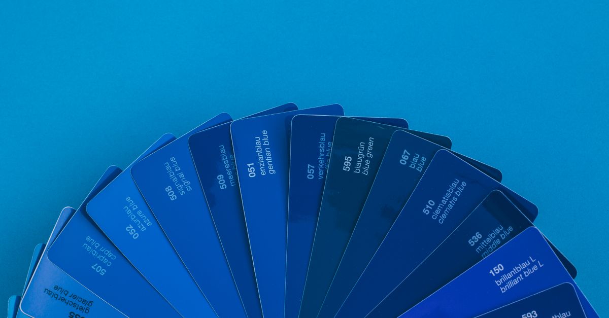
What "Shades" Mean in a Palette Generator
A single base color is not a flat value — it is one slice through a three-dimensional space. The generator does its math in HSL, which separates hue (0–360°), saturation (0–100%), and lightness (0–100%) instead of mixing red, green, and blue channels directly. That separation matters because lightness and saturation are the two axes that produce shades, tints, and tones without touching the hue.
- A tint raises lightness toward 100% — the color washes toward white.
- A shade lowers lightness toward 0% — the color darkens toward black.
- A tone lowers saturation toward 0% — the color mutes toward gray.
The monochromatic scheme in the generator holds the hue constant and steps lightness in even increments, which is exactly how designers build a clean tonal scale for shadows, hover states, borders, and depth in a UI. Stepping only lightness preserves the "mood" of the original color while expanding it into a usable family.
How Color-Wheel Variations Are Built
When the generator builds a variation rather than a shade, it rotates the hue while holding saturation and lightness steady. The base color sits at some point on the 360° hue circle, and every other color in the scheme is the base rotated by a fixed number of degrees. Six schemes cover the relationships designers reach for most often, and each one is described by a single hue offset that makes the geometry predictable.
| Scheme | Hue rotation | Colors | Mood | Best for |
|---|---|---|---|---|
| Complementary | Base + 180° | 2 | Strong contrast | Call-to-action accents, hero banners |
| Analogous | Base ± 30° | 3 | Calm, cohesive | Backgrounds, nature themes, brand spreads |
| Triadic | Base ± 120° | 3 | Vibrant, balanced | Illustrations, dashboards, playful UI |
| Tetradic | Base + 90° in two pairs | 4 | Rich, varied | Editorial layouts, multi-series charts |
| Split-complementary | Base + 150° and + 210° | 3 | Soft contrast | Secondary CTAs on busy backgrounds |
| Monochromatic | Hue fixed; lightness stepped | Multiple | Unified, tonal | UI states, typography scales, neutral systems |
The math uses proper hue wrap-around — a hue of 350° plus 30° lands on 20°, not 380°. That detail is invisible when the tool works but important when you understand why a complementary pair always stays the same distance apart no matter where you start on the wheel. Color theory describes these relationships formally; for the foundational definitions see the Color theory overview.
How to Generate Shades and Variations From One Base Color
Generating a complete palette — shades, tints, and color-wheel variations — takes three short steps in the Color Palette Generator:
- Choose a base color with the color picker or type a HEX value like #3b82f6.
- Select a color scheme — complementary, analogous, triadic, tetradic, split-complementary, or monochromatic.
- Click any swatch to copy its HEX, and read the RGB and HSL values shown beneath it.
The palette updates the instant you change either the base color or the scheme, so you can iterate without reloading. To capture a complementary accent for a hero button, switch the scheme and read the second swatch; to build a tonal UI scale, switch to monochromatic and copy each lightness step. If you want a slower walkthrough that focuses on choosing that first base color, the beginner's guide to picking one base color covers the same workflow in more detail.
Choosing the Right Variation for Your Project
Each scheme has a personality that maps naturally onto a different job, and picking the wrong one is the most common reason a palette feels "off" once it lands in a real layout.
- Complementary gives the strongest high-contrast pairing on the wheel. That makes it ideal for call-to-action accents and hero buttons, where the accent needs to stand away from the background.
- Analogous sits within 30° of the base, so it reads as calm and cohesive — colors you might see next to each other in a landscape photo. It works well for backgrounds, marketing spreads, and brand systems that want a unified feel without flatness.
- Triadic balances three colors 120° apart, giving vibrancy without the visual tension of a straight complement. Use it for illustrations, dashboards, and any UI where you want playful energy.
- Tetradic gives two complementary pairs, four hues total, for rich, varied palettes. It shines in editorial layouts and in charts that need to distinguish many series.
- Split-complementary softens a direct complement by taking the two hues 30° either side of the opposite point. You keep contrast without the visual vibration of a straight 180° pair — a good choice for secondary CTAs on busy backgrounds.
- Monochromatic stays within one hue and steps only lightness, which is why it is the workhorse for UI states, typography scales, and depth.
A common workflow is to pick your brand color as the base, generate a complementary or triadic set for accents, then switch to monochromatic to build out the neutral tints and shades around it. That sequence gives you one expressive hue, two or three accents, and a full lightness scale in three palette refreshes.
HEX, RGB, and HSL — Which Format to Use
Every swatch is shown in three formats so you can drop the value straight into the tool you already use. The right format depends on where the color is going and whether you plan to hand-tune it later.
| Format | Looks like | Best for |
|---|---|---|
| HEX | #3b82f6 | CSS color values, design-tool swatches, brand style guides |
| RGB | rgb(59, 130, 246) | CSS, image-editing software, JavaScript color objects |
| HSL | hsl(217°, 91%, 60%) | Hand-tuned shades and tints, programmatic color generation |
HEX and RGB drop directly into CSS or design apps like Figma; HSL is most useful when you want to fine-tune saturation or lightness by hand or generate derivative colors in code. HSL also makes it easy to describe variations in writing — "the same hue, just 20% darker" — without thinking in red/green/blue channel offsets.
Accessibility, Privacy, and Final Checks
A harmonious palette is not automatically an accessible one. When you apply colors to text and backgrounds, still check contrast against WCAG guidance — use a dedicated contrast check against WCAG AA and AAA to verify every text/background pair before shipping. Harmonious relationships are a design signal; readability for every viewer is a separate constraint that the color wheel does not enforce.
The generator runs entirely in your browser using client-side JavaScript, so no sign-up is required and your colors never leave your device. Nothing is uploaded, stored, or sent to a server, which means the base HEX you choose and every palette you generate stay private to your machine. You can use the resulting shades and variations in UI and web design, brand and logo work, data-visualization palettes, illustration, and interior or fashion mood boards — anywhere a designer needs a quick, mathematically correct set of related colors. Because the math runs on the color wheel with proper hue wrap-around, the relationships stay predictable no matter where you start, so the same scheme choice always produces the same family of moods.
Related reading: CMYK Color Chart Palette Ideas Built from CSS Color Names.