A color palette generator chart turns a single base color into a set of related swatches arranged by their position on the color wheel. Each row in the chart represents a classic scheme — complementary, analogous, triadic, tetradic, split-complementary, or monochromatic — and every swatch is labeled with its HEX, RGB, and HSL values. Designers have long treated the color wheel itself as a chart of relationships: complementary colors sit opposite each other (180° apart), analogous colors sit next to each other (±30°), and triadic colors are evenly spaced 120° apart. A generator that follows that chart can build a balanced palette in one click instead of rotating hues by hand. The result is a ready-to-use set of colors whose relationships stay mathematically consistent, because the math is done in HSL — where hue is a 0–360° circle that wraps correctly at 350° + 30° = 20°, not 380°. That same predictable rotation is what makes the chart trustworthy for branding, UI design, illustration, and data visualization.
How a Color Palette Generator Chart Maps the Color Wheel
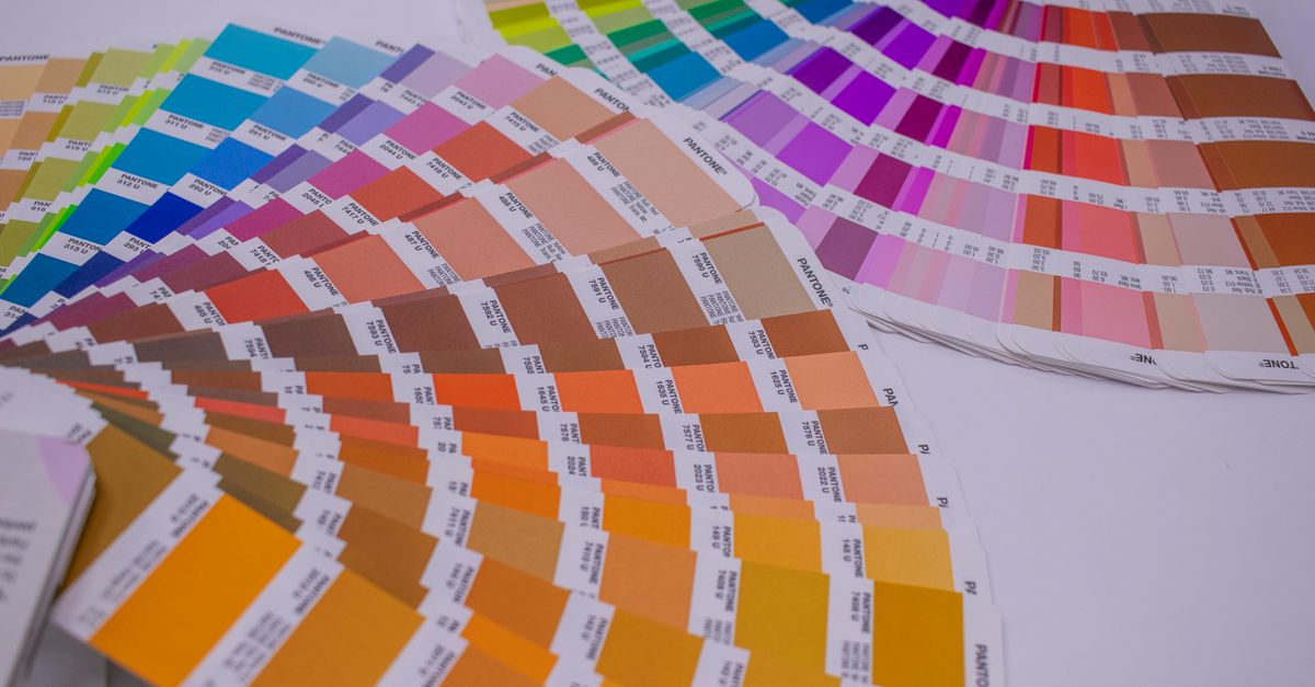
A color palette generator chart is a visual table that pairs a single base color with the related colors that sit at specific angles on the color wheel. Designers have used a printed color wheel as a reference chart for over a century to predict which hues will look harmonious together, and a modern generator encodes the same relationships so you do not have to rotate hues by hand. The result is a row of swatches — each one labeled in HEX, RGB, and HSL — that you can copy straight into a stylesheet or a design file.
The math behind that chart runs in the HSL color space on purpose. HSL separates a color into hue (a 0–360° position on the wheel), saturation, and lightness, so rotating the hue keeps saturation and lightness intact. That is why a complementary scheme generated from a soft pastel still feels like the same soft pastel — the relationships stay predictable instead of accidentally shifting the mood. Raw RGB does not give you that, because moving from one channel value to another changes both the perceived color and the relationships between colors. HSL also wraps correctly, so a hue of 350° plus 30° lands on 20°, not 380°. That wrap is what keeps the chart mathematically clean at the seam of the wheel.
The Six Scheme Relationships Side by Side
The six schemes a color palette generator chart exposes are the same six relationships color theorists have described for decades. Each one corresponds to a fixed angular offset from the base hue, which is why the chart can be generated automatically and still look consistent every time. The table below summarizes the offset, the visual feel, and the type of project each scheme tends to fit.
| Scheme | Hue rotation from base | Look and feel | Typical use |
|---|---|---|---|
| Complementary | +180° | Maximum contrast, bold pairing | Call-to-action accents on a primary brand color |
| Analogous | −30°, +30° | Calm, cohesive, naturally adjacent | Hero sections, backgrounds, mood boards |
| Triadic | −120°, +120° | Balanced, vibrant, evenly spaced | Illustrations, infographics, playful brand systems |
| Tetradic | +90°, +180°, +270° | Rich, two-pair variety | Charts with many categories, layered layouts |
| Split-complementary | +150°, +210° | Contrast softened by two neighbors | Highlights and links without pure-complement tension |
| Monochromatic | 0° (lightness stepped) | Single hue, tonal scale | Shadows, hover states, borders, neutral UI depth |
Per the standard color-theory relationships summarized by sources such as Wikipedia's color theory entry, those six schemes cover the relationships designers reach for most often, which is why a generator that implements all of them can stand in for hand-rotated swatches.
Generate a Palette From One Base Color
- Open the Color Palette Generator and pick a base color using the on-screen swatch picker, or type a HEX value directly into the input — for example, #3b82f6.
- Choose a scheme from the list: complementary, analogous, triadic, tetradic, split-complementary, or monochromatic. The palette row updates instantly as you change either the base color or the scheme.
- Read the labels under each swatch. Every color in the chart is shown in three formats — HEX, RGB, and HSL — so you can copy whichever one your design tool expects.
- Click any swatch to copy its HEX to your clipboard. The HEX value is what most CSS, Figma, and Sketch workflows paste in, so a single click is enough to move a color into your project.
- Switch to a second scheme when you need accents or neutrals around your base — for instance, complementary for a call-to-action, then monochromatic to build the surrounding tints and shades.
HEX, RGB, and HSL in the Same Row
Each swatch in the chart is labeled in three formats because each format has a different job. HEX is the shortest notation — six hexadecimal digits — and is what gets pasted into CSS custom properties, Figma fill inputs, and most brand style guides. RGB is the literal breakdown of the red, green, and blue channels on a 0–255 scale, which is useful when a tool or a library only accepts channel triplets, or when you need to compute a color from a script. HSL is the format that matches how the chart itself was computed: a hue angle from 0 to 360, a saturation percentage, and a lightness percentage.
Showing all three side by side means you can read the chart the way the math was done and still copy the format your target tool wants. If you only need to fine-tune the saturation of an accent, HSL is the easiest format to edit by hand because the hue stays the same while you nudge saturation and lightness. If you need to send a color to a printer or to a designer who works in CMYK, the HEX or RGB reading still gives you a clean starting point — the RGB to CMYK converter handles the next step in that workflow.
Putting the Chart to Work in Real Projects
A color palette generator chart is most useful when you anchor it to a real brand or UI decision. A common workflow starts with the brand color as the base — often the color that already appears in a logo or a primary button — then generates a complementary or triadic scheme for accents, links, and highlights. From there, switching to the monochromatic scheme builds the lighter tints and darker shades that the rest of the interface needs: hover states, borders, dividers, disabled states, and subtle elevation tints.
For data visualization, the chart plays a slightly different role. Categorical charts benefit from a triadic or tetradic set so each series reads as distinct without fighting the background, while sequential scales and heatmaps are usually better served by a monochromatic ramp generated from a single dominant hue. In both cases, the generator gives you a defensible starting palette rather than a random one, because the relationships come from the color wheel rather than from chance.
The same chart supports lighter creative work too. Illustration, mood boards, and fashion or interior palettes often lean on analogous schemes because adjacent hues feel natural and cohesive — close to the gradients you see at sunset or in foliage. For those projects, picking the mood color first and then sampling the two adjacent swatches on the chart produces a palette that holds together without further editing.
Contrast and Accessibility Beyond the Chart
A harmonious palette is not automatically an accessible one. The relationships on the color wheel describe how colors look next to each other, not whether text on a colored background can be read by people with low vision or color blindness. WCAG 2.2 defines specific contrast thresholds for body text, large text, and non-text UI components, and any pair you copy from the generator should still be checked against those rules before it ships.
Run any text-and-background pair from the chart through a contrast checker to see whether it meets AA or AAA. If a complementary accent looks bold on screen but fails contrast when used for body copy, the monochromatic ramp on the same base is usually a safer pick for text because stepping lightness changes the perceived brightness without introducing a second hue. For a deeper workflow that walks through this end to end, the Color Palette Generator for Accessibility Contrast guide pairs the generator with a contrast tool so the chart produces both palette and accessible pairings in one pass.
Because the generator runs entirely client-side in your browser, the base color and the swatches it produces never leave your device. There is no sign-up, no upload, and no server-side storage — every click on a swatch copies a HEX locally, which makes the chart safe to use on confidential brand colors, internal style guides, and work-in-progress palettes that have not been published yet.
Related reading: Color Contrast Checker Chart: Read WCAG AA and AAA.